How Documentation Analytics Can Help You Prioritize Design System Improvements
- Authors

- Name and Role
- Nezar MansourContent Writer
Product teams often build design systems in a vacuum. They spend months perfecting components while hoping that adoption follows naturally. Without data, these teams are essentially guessing what their designers and developers actually need to be successful.
Documentation analytics change this dynamic by transforming a passive reference site into a powerful sensor that reveals exactly where users are struggling. By treating documentation as a product, you can use real interaction data to bridge the gap between perceived needs and actual community demand.
Documentation as a high-fidelity sensor
Think of your documentation as a massive sensor array. Every session and page view is a signal that helps you understand which parts of your system attract the most attention and which drive the greatest value. By analyzing these patterns within a centralized platform, you can move from gut-feel updates to a data-driven strategy.
Metrics that actually guide priority
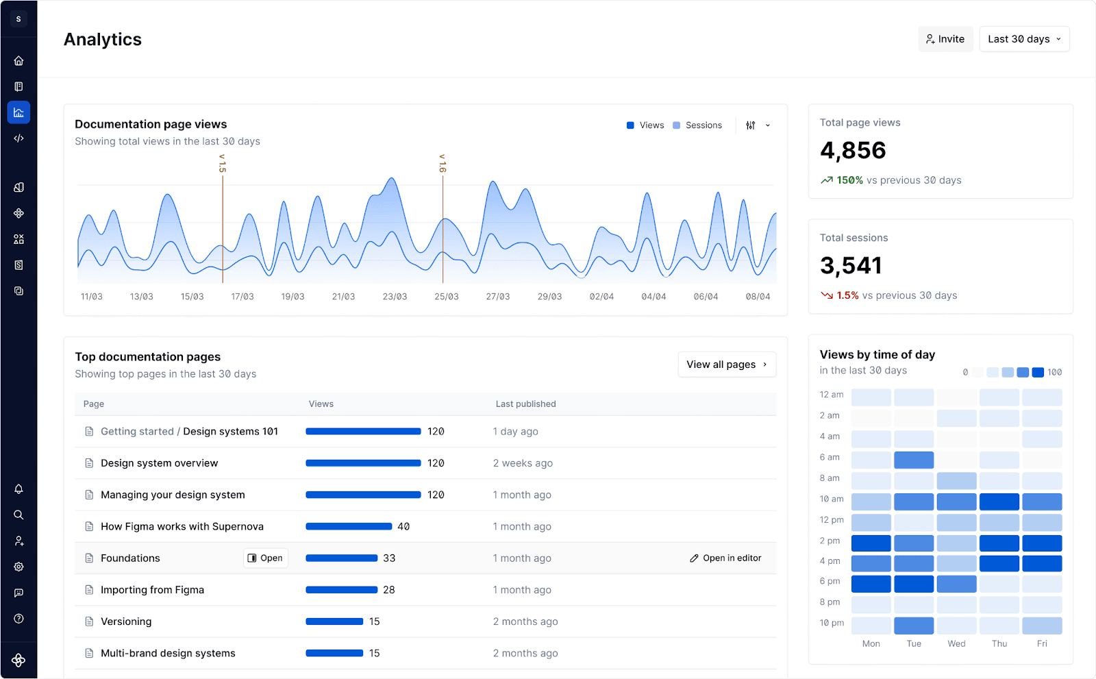
To prioritize effectively, you need to look at how the community is moving through your system over time. Supernova’s built-in analytics provide this visibility instantly, focusing on the core indicators of system health.
- Most Visited Pages: High traffic on specific component pages identifies your most valuable content. If a new component has low traffic, it typically points to a discovery or onboarding issue rather than a lack of need.
- Average Sessions by Date: Monitoring session frequency over time allows you to track design system adoption and engagement. Spikes in sessions often correlate with new project kick-offs, giving you a chance to offer extra support to those specific teams.
- Bounce Patterns and Paths: High drop-off rates on pages indicate a broken entry point. If users aren't finishing your setup guide, your adoption is being choked at the source.
Exposing gaps in components and onboarding
Analytics act as an early warning system for critical areas of your design system. Data reveals the difference between what you have documented and what users are trying to achieve.
- The Phantom Component Gap: When you see high traffic on a page that only describes a coming soon component or a surge in views for a basic workaround, you have identified a phantom gap. These are the tools your team is actively looking for to do their jobs.
- The Guideline Friction Point: If users are spending an unusual amount of time on a simple checklist page, it suggests the information is too dense or difficult to parse. In documentation, time on page often indicates confusion rather than deep engagement.
- The Onboarding Dead End: By tracking the journey of new hires, you can see exactly where they drop off. If a large percentage of new developers stop at the environment setup page, you know exactly where your onboarding flow is broken.
The 360-degree view with GA and Hotjar
While built-in analytics provide immediate visibility, the real power comes from connecting these insights to your broader tech stack. Supernova allows you to integrate seamlessly with third-party tools to get the full story behind the data.
- Deep Funnel Analysis with Google Analytics: By providing your GA4 Measurement ID in your documentation settings, you can track the entire user journey. You can see which departments are referencing the documentation most frequently and how they navigate from a basic guide to a complex technical spec.
- Qualitative Context with Hotjar: While built-in tools tell you that a page is popular, Hotjar heatmaps show you how it is being used. You can see if users are getting stuck on a specific code snippet or if they are repeatedly hovering over a confusing diagram.
Best practices for analytics and feedback loops
Setting up a data-driven system is about more than just installing a script. It requires a process that turns raw numbers into actionable improvements.
Step 1: Instrument your primary entry points
Ensure you are tracking behavior across the board. Connect your documentation hub to your Figma files and code repositories. This creates a visibility layer that shows the relationship between design intent and actual usage.
Step :2 Define your core success metrics
Move beyond page views. Choose three to five key performance indicators that reflect your system’s health. Examples include onboarding completion rates or design-to-code parity spikes following a major documentation update.
Step :3 Establish a monthly analytics sync
Review your top-performing pages with design and engineering leads. If a page has high traffic but your support channels are filled with questions about that same topic, you have objective proof that the page needs a total rewrite.
Step 4: Connect documentation to user support
Map your analytics against your Slack or Jira support tickets. Use documentation usage data to prioritize which support requests should be turned into permanent, self-serve articles to reduce future team burden.
Step 5: Close the loop with AI agents
Use machine-readable documentation via the Model Context Protocol (MCP) to allow AI agents to analyze usage patterns. An agent can summarize a month of interaction data and suggest specific edits to improve clarity and adoption.
The shift toward data-driven design systems is ultimately about having empathy for your users. By listening to the data, you are listening to the frustrations and needs of your colleagues. When you prioritize based on documentation analytics, you aren't just building a better system; you are building a more inclusive and helpful one.
Stay tuned to the Supernova blog for all the latest on design systems.
One final piece of advice Don't try to automate everything at once. Start by focusing on your most visited pages. It is the most revealing data you can collect right now. If you improve the documentation for your top five components this month, you will see a measurable spike in user trust and system adoption.