DESIGN.md for Design Systems: What Fits in the File
We wrote a DESIGN.md for Skyscanner's Backpack design system. 434 tokens became 32, dark mode and 16 button props had nowhere to go. What fits and what doesn't.
 Nezar MansourContent Writer
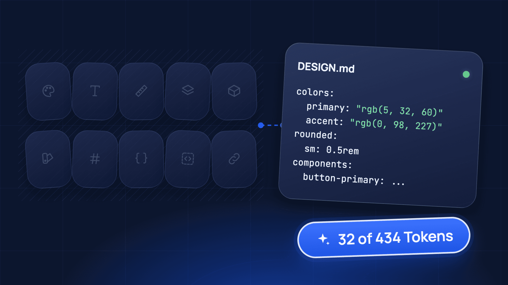
Skyscanner's Backpack design system ships 434 design tokens in its web foundations package. We wrote a DESIGN.md for it by hand, following the spec. The file ended up with 32.
That gap is the useful part. A DESIGN.md is good at telling an agent what a product should feel like. It is a poor place to hold the exact values, component APIs and versions an agent needs to build inside an existing product. Below is the file, what made it in, what didn't, and when to point an agent at the source instead.
What Is DESIGN.md?
DESIGN.md is a markdown file that describes a visual identity to AI coding agents. It holds design tokens as YAML at the top and plain-language rationale in the body. Google Labs introduced it in its Stitch design tool and open-sourced a draft spec on 21 April 2026.
The spec on GitHub is still marked alpha, as of 3 November 2026. It defines:
- Token groups:
colors,typography,rounded,spacingandcomponents, with references like{colors.primary}. - Body sections, in order: Overview, Colors, Typography, Layout, Elevation & Depth, Shapes, Components, and Do's and Don'ts.
- A CLI:
lintvalidates the file,diffcompares two versions, andexportconverts tokens to Tailwind or W3C DTCG format.
The format took off fast. VoltAgent's awesome-design-md, a collection of DESIGN.md files extracted from public websites, had about 125,000 GitHub stars when we checked on 3 November 2026.
If you're deciding what goes in your project instructions file instead, that's a different file with a different job: see what to put in CLAUDE.md for a design system.
A Worked DESIGN.md From a Real Design System
We used Backpack because it is public, mature and actively released. The source was @skyscanner/bpk-foundations-web version 24.9.0 (released 6 October 2026), and the button API from @skyscanner/backpack-web 43.19.0.
Here is the front of the file, shortened:
---
version: alpha
name: Backpack (day mode)
colors:
  primary: "rgb(5, 32, 60)"
  accent: "rgb(0, 98, 227)"
  surface: "rgb(255, 255, 255)"
  on-surface: "rgb(22, 22, 22)"
  error: "rgb(231, 8, 102)"
typography:
  body-md:
    fontFamily: "Skyscanner Relative"
    fontSize: 1rem
    fontWeight: 400
    lineHeight: 1.5rem
rounded:
  sm: 0.5rem
  md: 0.75rem
components:
  button-primary:
    backgroundColor: "{colors.primary}"
    textColor: "{colors.surface}"
    rounded: "{rounded.sm}"
    height: 2.25rem
  button-primary-pressed:
    backgroundColor: "rgb(21, 70, 121)"
---
And part of the body, where the format earns its keep:
## Colors
Navy `primary` carries primary actions. Blue `accent` is for links
and hero surfaces, never for buttons.

## Do's and Don'ts
- Do use one primary button per view
- Don't use the accent blue as a button background
That second block is the strongest thing in the file. It says why two blues exist and which one belongs on a button. A raw token list can't say that, and it's the reasoning an agent misses most when it generates a new screen.
What Made It In, and What Didn't
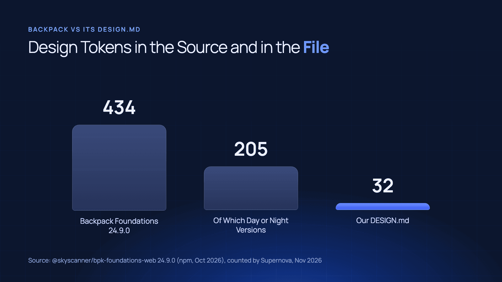
The full file has 14 colours, 5 type styles, 5 radius steps, 5 spacing steps and 3 component entries. Here's how that compares with the source, counted from the npm packages on 3 November 2026:
| Backpack source | Our DESIGN.md | Why the gap | |
|---|---|---|---|
| Design tokens | 434 | 32 | A file people can read can't carry every token |
| Tokens split into day and night versions | 205 (102 pairs) | 0 | The alpha spec has no field for themes or modes, so the file picks one |
| Button colour tokens | 54 | 3 component entries | Each type and state needs its own entry |
| Button types and sizes | 9 types, 2 sizes | 1 type, 2 sizes | Same reason |
Button props (loading, iconOnly, href, ...) | 16 | 0 | Component entries hold 8 style properties, not an API |
| Component packages | 99 | 1 | Every component is written out by hand |
Three gaps matter most when an agent builds inside an existing product.
Resolved values go stale. The file copies values. Backpack's foundations package had 12 releases in 2026 by early October, and its component package had 81 stable releases between January and August. Each one can change a value the file still states as fact. The spec's diff command compares two DESIGN.md files. It can't tell you the file no longer matches the system.
Component props have no slot. The spec's components section is a map of 8 style properties: backgroundColor, textColor, typography, rounded, padding, size, height and width. Backpack's button takes 16 named props. Whether a loading button keeps its width, or whether an icon-only button needs a label, can only go in prose. The spec itself says the components part "is actively evolving".
Modes double the file or drop out. Backpack gives 102 of its tokens two values, one for day and one for night. The alpha spec has no concept of a theme. You either write two files, invent naming like primary-night, or leave dark mode out, which is what we did.
Is a DESIGN.md Enough for Your Agent?
It depends on the job.
For a new page with a consistent look, yes. If an agent is generating fresh UI and needs a palette, a type scale and some taste, a DESIGN.md is a fast, cheap win. It's also where the rules that live in nobody's token file can finally get written down.
For work inside a shipped product, no. There the agent has to output a specific component, with the right props, in the right theme, at today's values. The file is readable. The agent needs something it can resolve: ask for button-primary and get back the current value, the variants and the component it maps to.
That's the trade with any summary. It's accurate on the day you write it, and nothing warns you when it stops being accurate. We saw the same pattern when we traced why documentation goes out of date.
When to Point the Agent at the Source
Keep the DESIGN.md for intent: the overview, the colour roles and the do's and don'ts. Point the agent at the system itself for anything it has to get exactly right.
That's what a design system MCP server is for. Supernova's MCP server returns entities rather than pages: a token with its resolved value, and the components that use it, read from the system at the moment the agent asks. Lookups are unlimited on every plan, including the free Starter plan. Our comparison of design system MCP servers covers the other options, and connecting one to Claude Code or Cursor takes a few commands.
Write the File Your Tokens Can't
If you're writing a DESIGN.md this week, spend your time on the sections a token file has never held: the overview, the colour roles and the do's and don'ts. Keep the YAML short and say in the overview which package version it was taken from.
Then give the agent a way to check the real values. The file tells it what you meant. The source tells it what's true today.
Give your agents a system worth following
See how Supernova documents, syncs, and serves your system in one place.