Setting Up a Design System in Claude Design
We set up one design system in Claude Design twice, from screenshots and from code and tokens, then counted off-system colours, spacing and components.
 Nezar MansourContent Writer
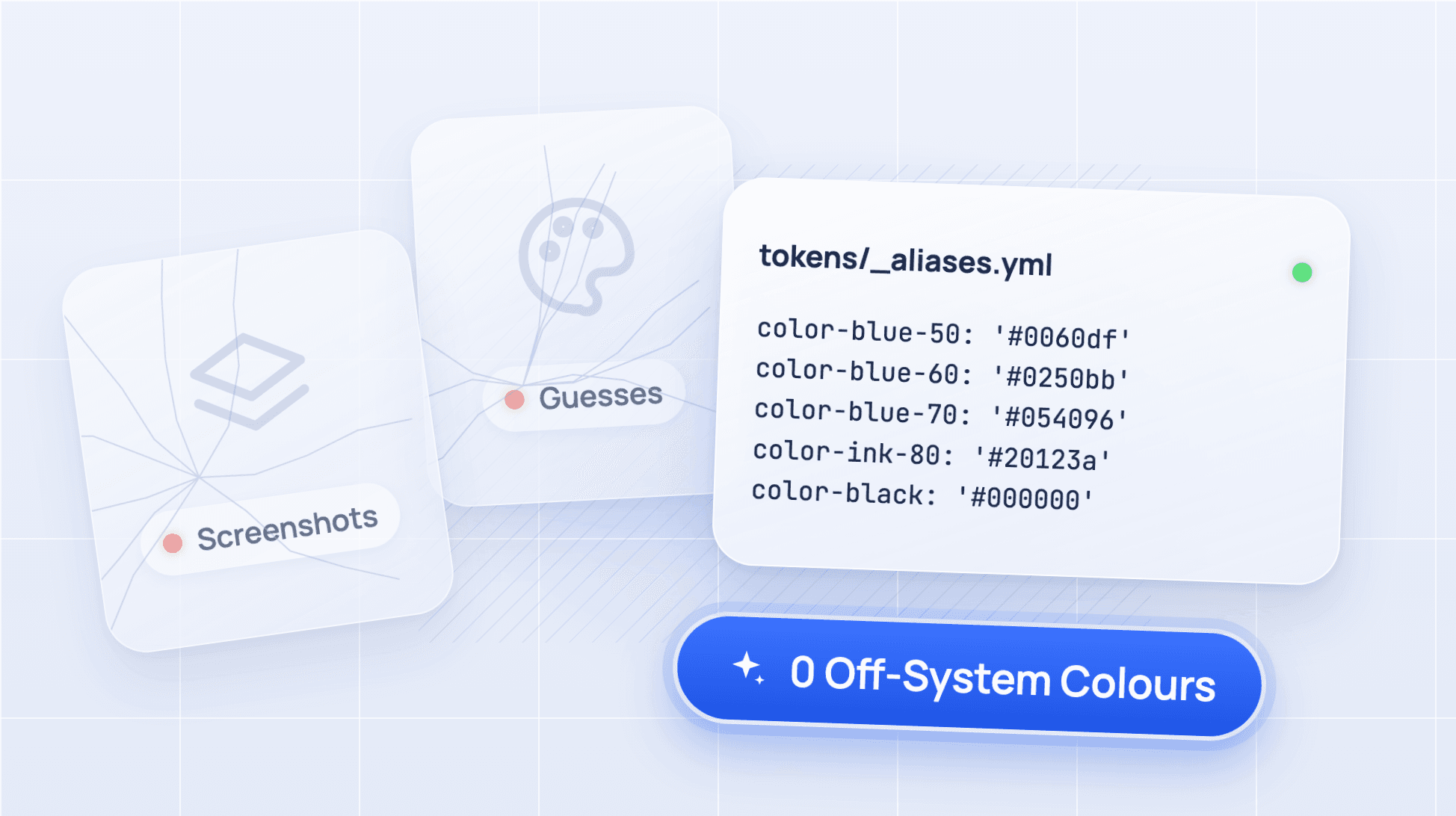
Ten colours that aren't in the system, against zero. That's the gap we measured when we set up the same design system in Claude Design twice, once from screenshots and once from its code and token files, then asked each version for the same three screens.
Claude Design is Anthropic's visual design tool, launched on 17 April 2026. Its design system setup reads whatever you give it (screenshots, a codebase, decks, logos) and writes a design system that every new project then uses. Anthropic's setup guide says you only need one source to start. Our test asked which source, and counted what changed.
The results: screenshots against code and tokens
We used one system, two setups and three prompts, giving six generated screens. Each number is a total across the three screens of that setup.
| Count (all 3 screens, method below) | A: screenshots only | B: code and tokens |
|---|---|---|
| Colours not in the system | 10 | 0 |
| Off-scale spacing values | 18 | 7 |
| Spacing declarations that were off-scale | 55 of 193 (28%) | 19 of 142 (13%) |
| Components or patterns the system doesn't have | 13 | 2 |
Source: our test in standalone Claude Design (claude.ai/design, beta), 11 and 12 November 2026, Claude Pro plan, Opus 5.5 at Medium effort. Colours and spacing are unique values per screen, summed.
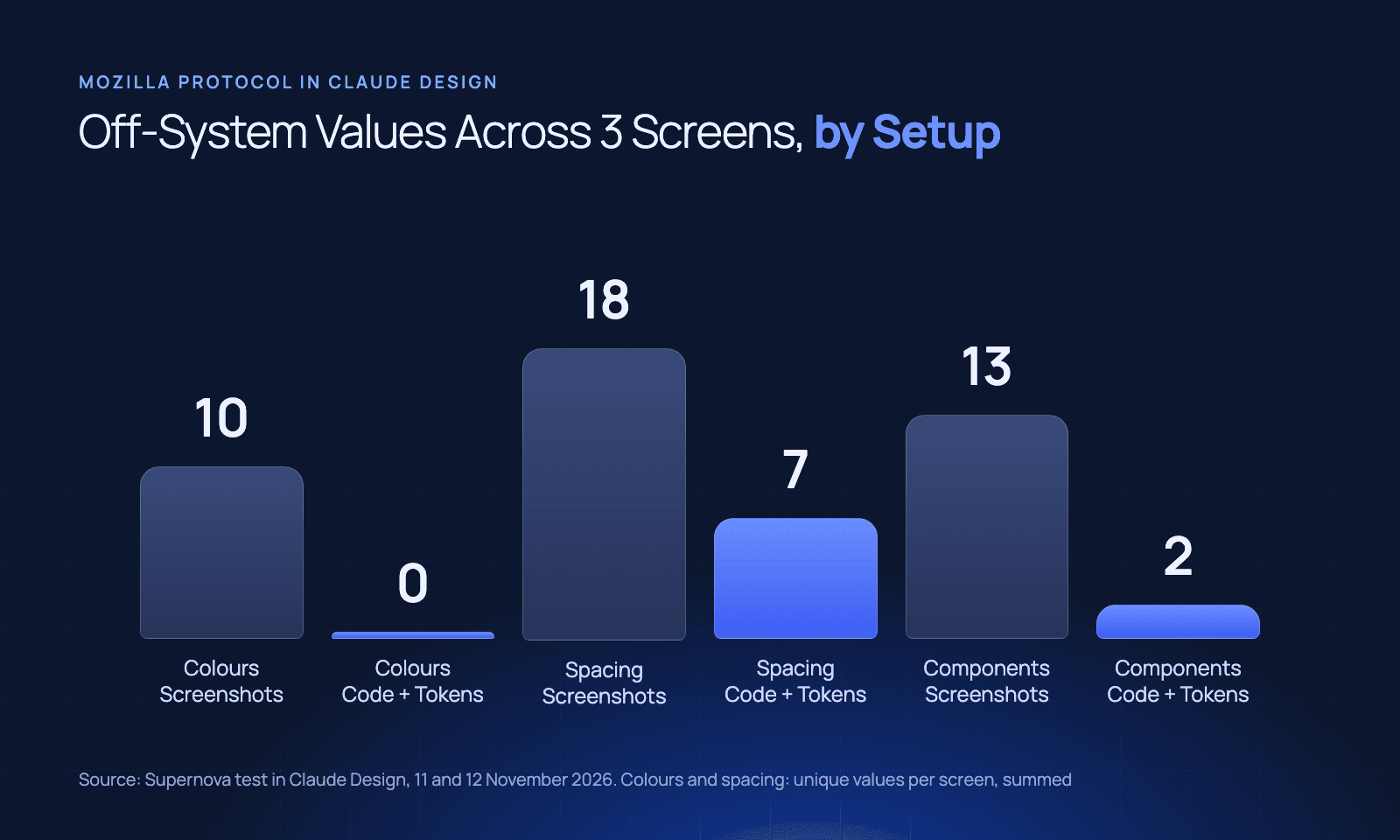
Code and tokens removed every off-system colour and most of the invented components. They didn't stop the model writing its own spacing: setup B still wrote 2, 10, 12, 18 and 20 px, none of which are on Protocol's scale.
What we tested, and how
The system. Mozilla Protocol, the design system behind mozilla.org, at commit 9107746 (6 November 2026), with its tokens package @mozilla-protocol/tokens 7.0.0. It has about 30 components, ships its tokens as data and has a live site to screenshot.
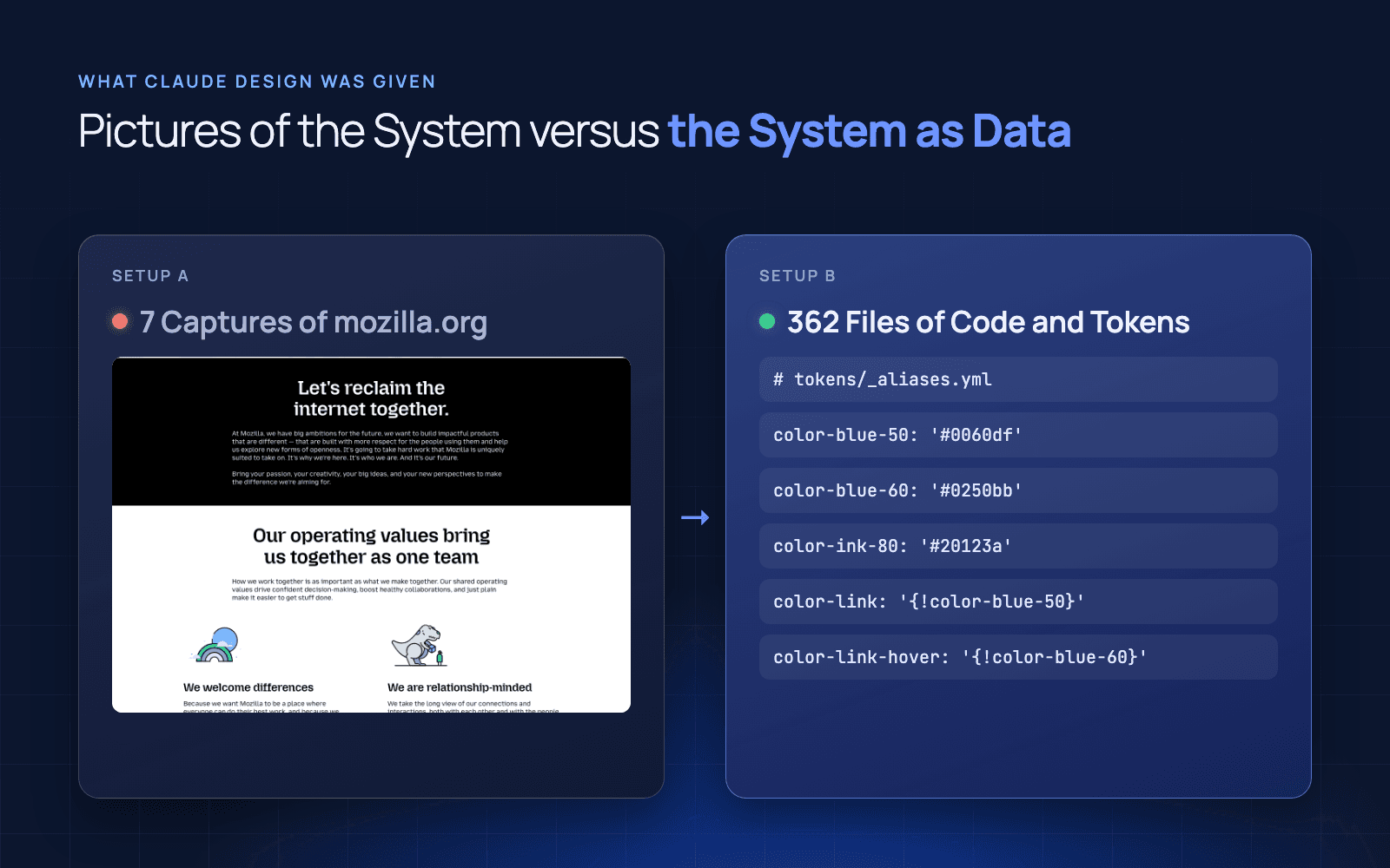
Setup A, screenshots only. Seven full-page captures of mozilla.org (home, Firefox, about, careers, contact, newsletter, products) at 1280 px wide. No code, no notes.
Setup B, code and tokens. A linked folder of Protocol's Sass, its component templates and the tokens package: 362 files. No screenshots.
The screens. For each setup we opened three new projects, picked that design system and the blank template, and pasted one prompt with no follow-ups. The prompts were fixed before either setup ran:
- Sign-in: a sign-in page for a sync product called Sync Hub, with email, password, a Sign in button, a reset link and a create-account link.
- Settings: an account settings page with editable user details and a table of five connected devices, status shown visually.
- Error and confirmation: a change-password form after a failed submit, with errors on two fields, and the confirmation page after success.
The counting. A script pulled each page's source, resolved every CSS variable through that setup's token files and compared the results with the 150 colours in Protocol's tokens package (plus the form-error red in its Sass) and its spacing scale (0, 4, 8, 16, 24, 32, 48, 64, 96 and 192 px). Components were judged by hand against Protocol's component folder, the same way for both setups.
What each setup actually built
The difference starts before any screen is generated. Here is what Claude Design wrote as the design system itself.
| A: from screenshots | B: from code and tokens | |
|---|---|---|
| Colour tokens written | 41 | 210 |
| Matching a real value in Protocol's tokens | 27 (66%) | 210 (100%) |
| Spacing scale | Adds 12, 80 and 128 px, drops 192 | Protocol's own names and values |
| Components | 14, described as "my own reading of the screenshots" | Protocol's inventory, in six groups |
Setup A was honest about its limits. Its summary said every size and spacing value was estimated from the captures and every colour sampled from pixels, and it asked for the Protocol code or a Figma file to make the result exact.
Three of its sampled greys (#757575, #f4f4f4 and #f0f0f0) then turned up on all three screens. That is how off-system values spread: one guess in the design system becomes a token, and every screen after it uses the token.
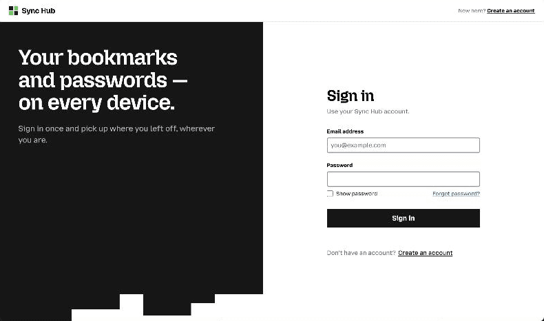
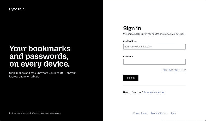
The two sign-in screens look close at a glance. The difference is underneath. Screen A used a placeholder logo mark, a stepped panel copied from mozilla.org's marketing art and the Lucide icon set, none of which are Protocol components. The B screens named Protocol's own parts in their code (Navigation, Footer, NotificationBar, FormErrors, InputField, Button) and used the real mzp-u-data-table class on the settings screen.
Where code and tokens still drifted
Setup B wasn't perfect, and the gaps are worth knowing before you rely on it.
- Spacing: 19 of 142 spacing declarations were off-scale. The model reached for values like 10 and 12 px for small gaps, which Protocol doesn't have.
- A status badge: the settings screen needed a visual status, Protocol has no badge, so the model built one with a coloured dot.
- Numbered steps: both setups invented a "what happens next" step list for the confirmation page.
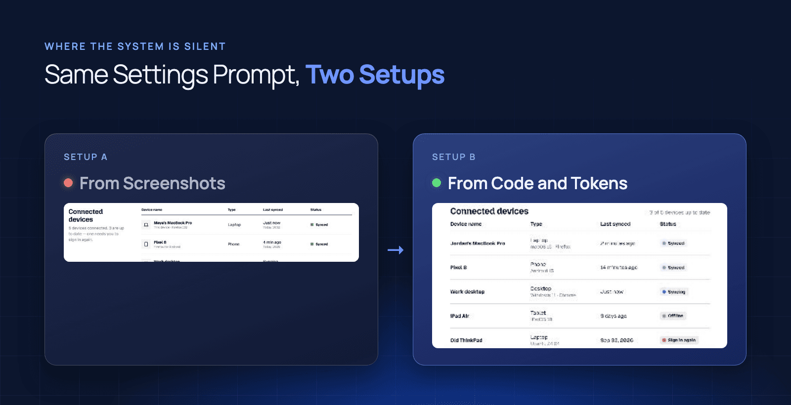
The pattern is consistent. Where the system had an answer as data, Claude Design used it. Where the system was silent, it invented something plausible. Colours were fully specified in the token files, so drift went to zero. Spacing rules lived partly in Sass and partly in habit, so drift dropped but didn't disappear.
That is the difference between a design system you can read and one an AI tool can resolve. A screenshot shows a colour. A token file says which colour, by name, with its exact value. The tool can only follow what it can look up.
How to prepare your design system for Claude Design
If you're setting up a design system in Claude Design, these are the inputs that made the difference in our test.
- Token files as data: YAML or JSON with names and exact values. This removed every off-system colour. Our explainer on what design tokens are covers the format.
- The component source: templates or components, not pictures of them. Setup B used Protocol's component names because it could read them.
- Your spacing scale, written down: if the scale only exists in how your CSS happens to be written, expect the tool to fill gaps with its own numbers.
- Rules for the gaps: decide what should happen when a screen needs something the system doesn't have (a badge, a step list). If you don't, the tool decides for you.
If your system is built as React components, the setup dialog offers a "Create using Claude Code" route, which it labels best fidelity, and Anthropic's guide points React teams to the /design-sync command. We didn't test that route, because Protocol is Sass and templates. For the coding side of the same problem, see what to put in CLAUDE.md for a design system and how to connect your design system to Claude Code.
Limits of this test
- One sample: one system, one run per screen, six screens. A rerun would give different numbers.
- The model already knows mozilla.org: setup A ran a web search while building, and 27 of its 41 colours matched Protocol exactly. A brand the model has never seen would probably do worse from screenshots.
- Self-correction: Claude Design ran its own "fixing" passes after some drafts. We counted the final files, which is what you would get.
- Selective reading: Claude Design says it copies selected files from a linked folder, so setup B may not have read all 362.
- Source, not pixels: we counted values in the generated code, not in rendered pixels.
- A product in motion: Anthropic is moving Claude Design into Claude, and the standalone site at claude.ai/design closes on 14 December 2026. Design systems move with it, but results from the new version may differ.
Good enough for a small app, not for a scaling system
For a smaller app or a test project, setting up a design system in Claude Design from code and tokens is good enough. Point it at your token files and component source, check the first few screens and you'll get output that stays inside your colours and uses your real components.
Teams scaling a design system across products need more than a one-off import. The import is a snapshot: it was right on the day we ran it, and nothing tells the tool when your tokens change. Every new screen, product and agent multiplies the cost of that drift, and someone has to own keeping the source current. That's the job Supernova does: it keeps tokens, components and documentation in sync as data, so every tool your teams use reads the current version.
If you're weighing that decision, start with whether to build or buy a design system platform, the hidden maintenance cost of a DIY design system, and when an engineering team should invest in a design system tool.
Give your agents a system worth following
See how Supernova documents, syncs, and serves your system in one place.