Storybook for Designers: Why It’s More Than Just a Dev Tool
- Authors

- Name and Role
- Nezar MansourContent Writer
For years, Storybook has been seen as a developer-centric tool. But for design teams working on modern component-based design systems, that perception is changing. Storybook now plays a critical role in bridging the gap between design and development, improving collaboration, testing edge cases, and providing a single source of truth across teams.
This post explores how designers can benefit from working with Storybook and how new integrations, like Supernova’s native Storybook support, make it easier than ever to embed Storybook into your design system workflow.
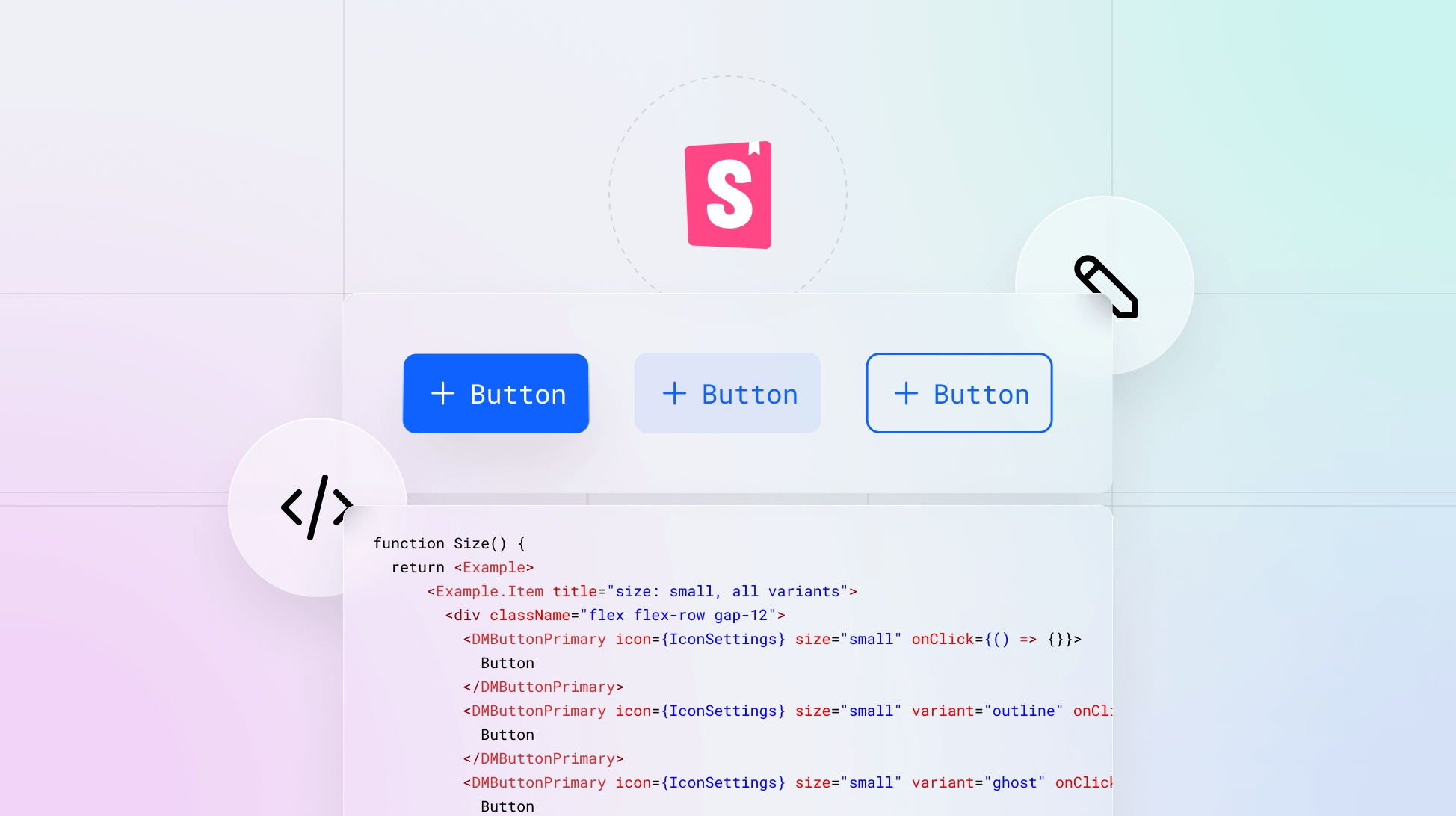
What is Storybook?
Storybook is an open-source frontend workshop environment that allows teams to develop and test UI components in isolation. By removing application-level constraints and business logic, it gives teams a focused space to build, document, and experiment with components across different states and configurations.
It supports popular frameworks like React, Vue, Angular, and Svelte, and as of version 8.5/8.6, includes powerful enhancements like mobile UI improvements, automated visual testing, and better performance overall.
Why designers should care about Storybook
While traditionally championed by developers, Storybook offers a host of benefits tailored to design teams as well.
1. See components in action, not just in theory
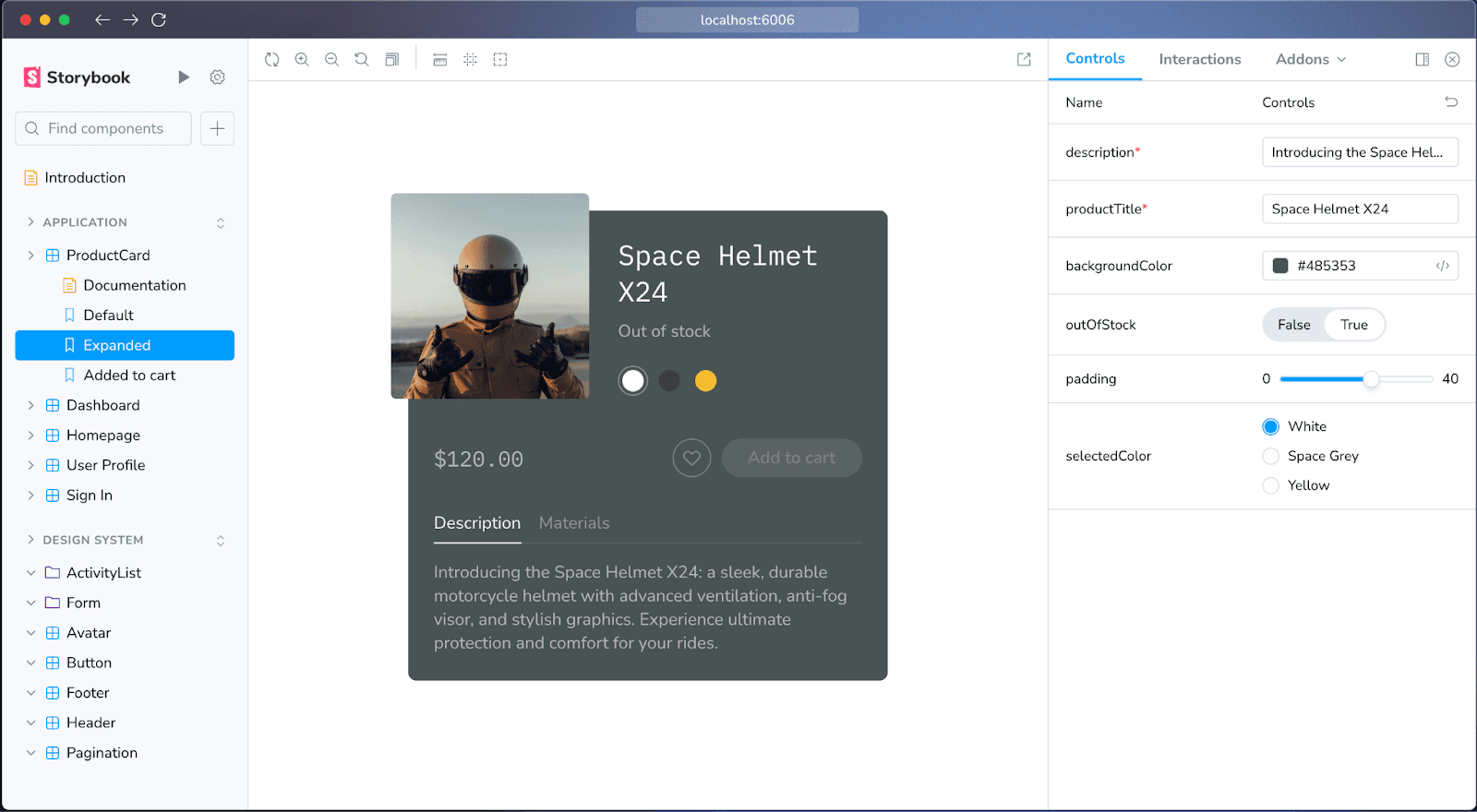
The Canvas view in Storybook presents a live, interactive version of your components. Designers can preview how components behave across different states like hover, loading, error, all without writing a line of code.
2. Controls let you explore variations without dev help
Storybook’s Controls panel allows non-developers to modify component props live in the browser. Want to test how a component handles long labels or different color schemes? Controls let you experiment freely and see exactly how the UI responds.
3. Document once, use everywhere
Storybook doubles as a living documentation hub. You can add usage guidelines, design rationale, and edge cases directly alongside working components. When integrated into your broader documentation setup (more on that later in the article), this becomes a powerful way to reduce misalignment across teams.
4. Visual parity with Figma and design tools
Thanks to tools like Storybook Connect and story.to.design, you can link directly to your Figma files or even embed components back into Figma itself, creating a two-way bridge between design and development tools.
Collaborating better with developers
A core challenge for design systems is aligning what’s designed with what’s actually shipped. Storybook helps teams:
- Build a shared vocabulary between design and engineering
- Give real-time feedback during component development
- Reduce handoff issues by making the component itself the spec
Teams that use Storybook effectively report saving up to 10 hours per week through improved collaboration.
Testing edge cases: beyond the perfect UI
Storybook empowers teams to test for real-world complexity:
- Responsiveness: Test how components behave across screen sizes
- Accessibility: Use built-in tools to catch compliance issues
- States: Simulate loading, error, and success variations
- Visual regressions: Leverage tools like BrowserStack visual testing to ensure design consistency over time
Design isn’t just about best-case scenarios, and Storybook gives designers tools to own that reality.
Real-world success stories
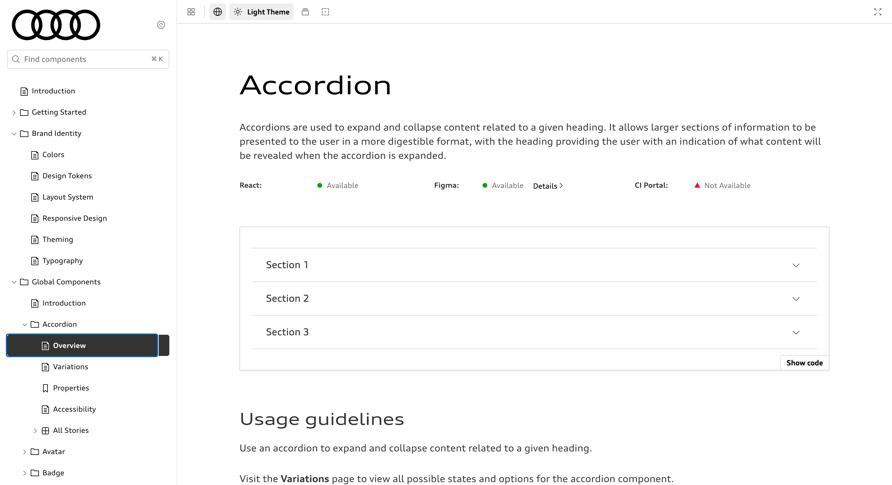
Audi
Audi uses Storybook to maintain a unified design system across its digital ecosystem, including websites, mobile apps, and in-vehicle interfaces. By embedding Storybook into their design and dev workflows, they’ve been able to ensure UI consistency across platforms, reduce redundant effort, and accelerate development cycles. The result is a scalable component library that supports Audi’s global digital presence.
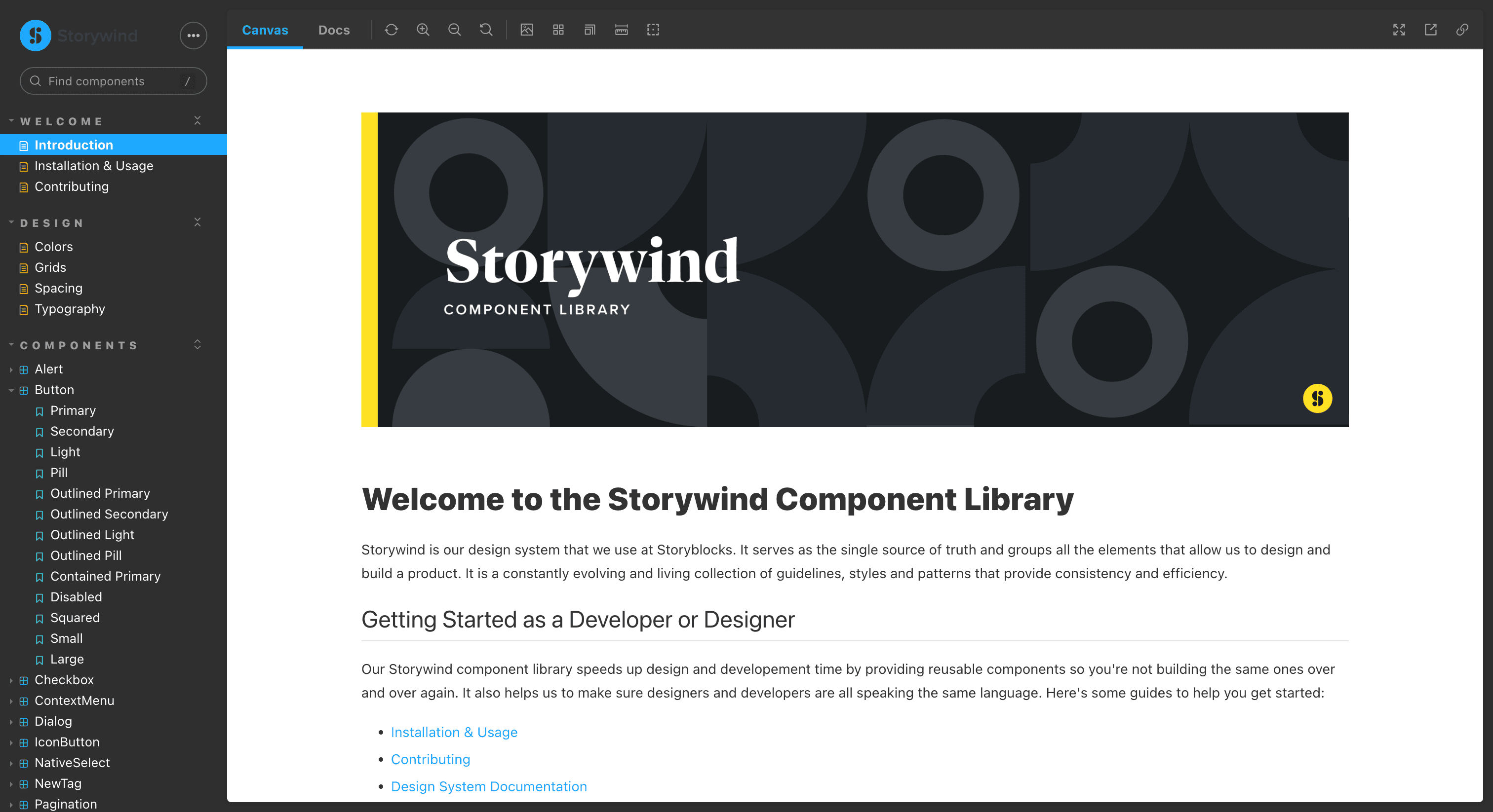
Storyblocks
At the other end of the spectrum, Storyblocks adopted Storybook to build a component repository for their broader design system. By documenting components as they built them, Storyblocks created a scalable foundation that increased consistency and allowed both designers and developers to move faster without waiting for full handoffs. Even with limited resources, they built a system that made a tangible difference in daily workflows.
Getting started as a designer
Even if your team is already using Storybook, it’s worth learning how to make the most of it as a designer. Here’s how to start:
- Ask for access to your team’s Storybook workspace — many use shared platforms like Chromatic
- Learn to navigate: Use the Canvas and Controls panels to preview and tweak components
- Contribute documentation: Add usage tips, edge cases, and Figma links
- Compare implementations: Use side-by-side views with Figma to spot inconsistencies
And with Supernova, it’s now easier than ever for designers to work directly in Storybook-powered environments.
Supernova now supports native Storybook integration
One of the historical pain points with Storybook was its positioning as a standalone dev tool, often siloed from the rest of the design documentation. This led many designers to avoid using it entirely.
Supernova changes that.
With our new native Storybook integration, you can now connect your Storybook as a data source, embed interactive component playgrounds, and control how your stories appear directly inside your documentation — no iframes, no manual pasting.
Designers can now:
- Browse stories from a searchable list
- Embed multiple states of the same component
- Control property visibility and configuration
- Use tabs to manage different documentation views
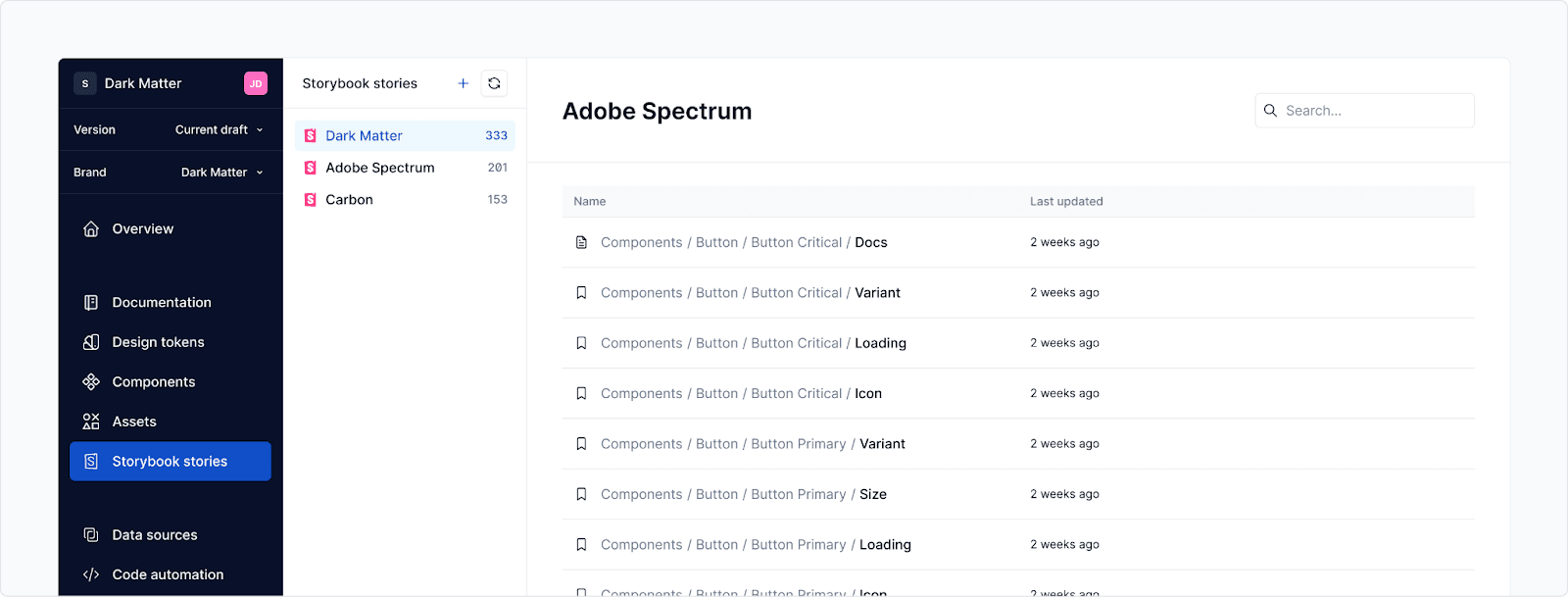
You can even see and manage all imported Storybook stories from one place, with information on when they were last updated, making it easier to verify if everything was imported properly.
Storybook isn’t just for developers anymore. It’s a powerful ally for design teams, providing the visibility, control, and collaboration needed to ship consistent, high-quality UI across products. And with Supernova’s new Storybook integration, those benefits are now accessible right inside your design system documentation, making it easier than ever to bring your components to life.