Top Ten Most Common Design System Components
- Authors

- Name and Role
- Nezar MansourContent Writer
We've talked before about design system components and their importance. Components are the essential building blocks of design systems and what most designers and design system practitioners spend time on. However — not all components are created and treated equally. We wanted to understand which components mattered more to designers, and we're uniquely positioned to find out. So we popped the hood on the Supernova engine to see what's underneath.
In this article, we'll explore the top ten most common design system components, how common they are, and why they're crucial for designers and design system practitioners. Whether you're just starting with a design system, want some help prioritizing, or are just curious about the data — read on to learn more.

State of Components 2023 Report
Get the latest insights on component trends and best practices.
Download Now](https://www.supernova.io/state-of-components#download)
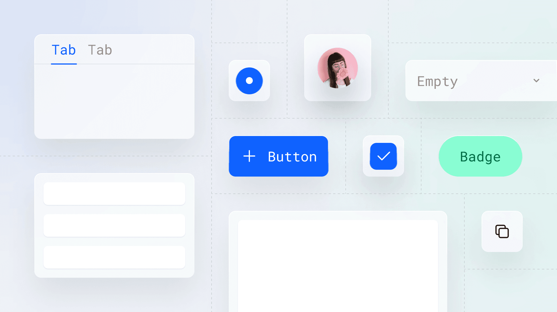
Top ten design system components
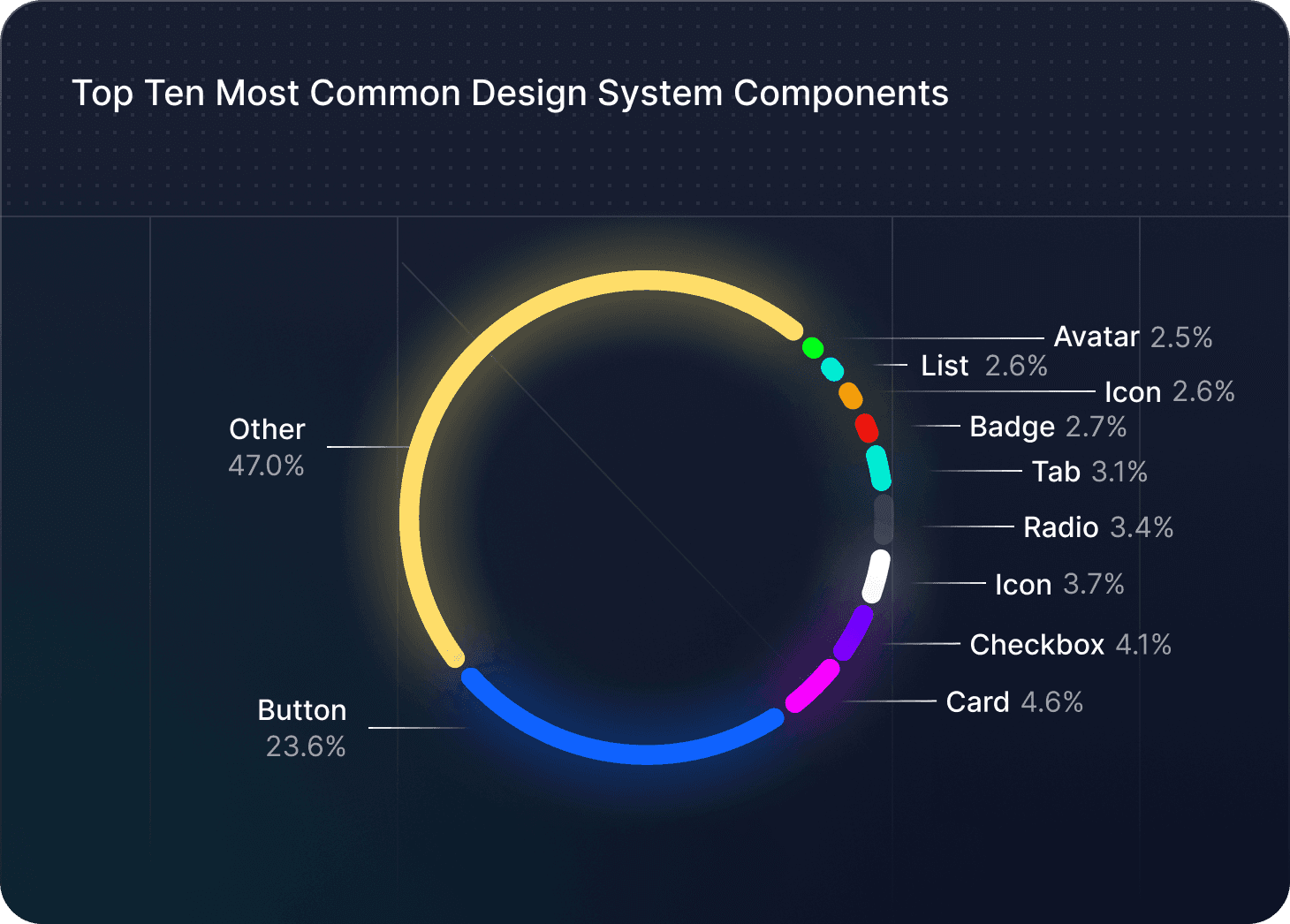
If you're unfamiliar with Supernova, it's the ultimate end-to-end design system platform. Users use it to import, manage, document, and deliver their design system components amongst other things. We ran the numbers to generate a chart of the most common design system components to help you visualize the distribution:
To help us understand more why these specific components made the list, let's take a look at each one and how teams are using them.
1. Button
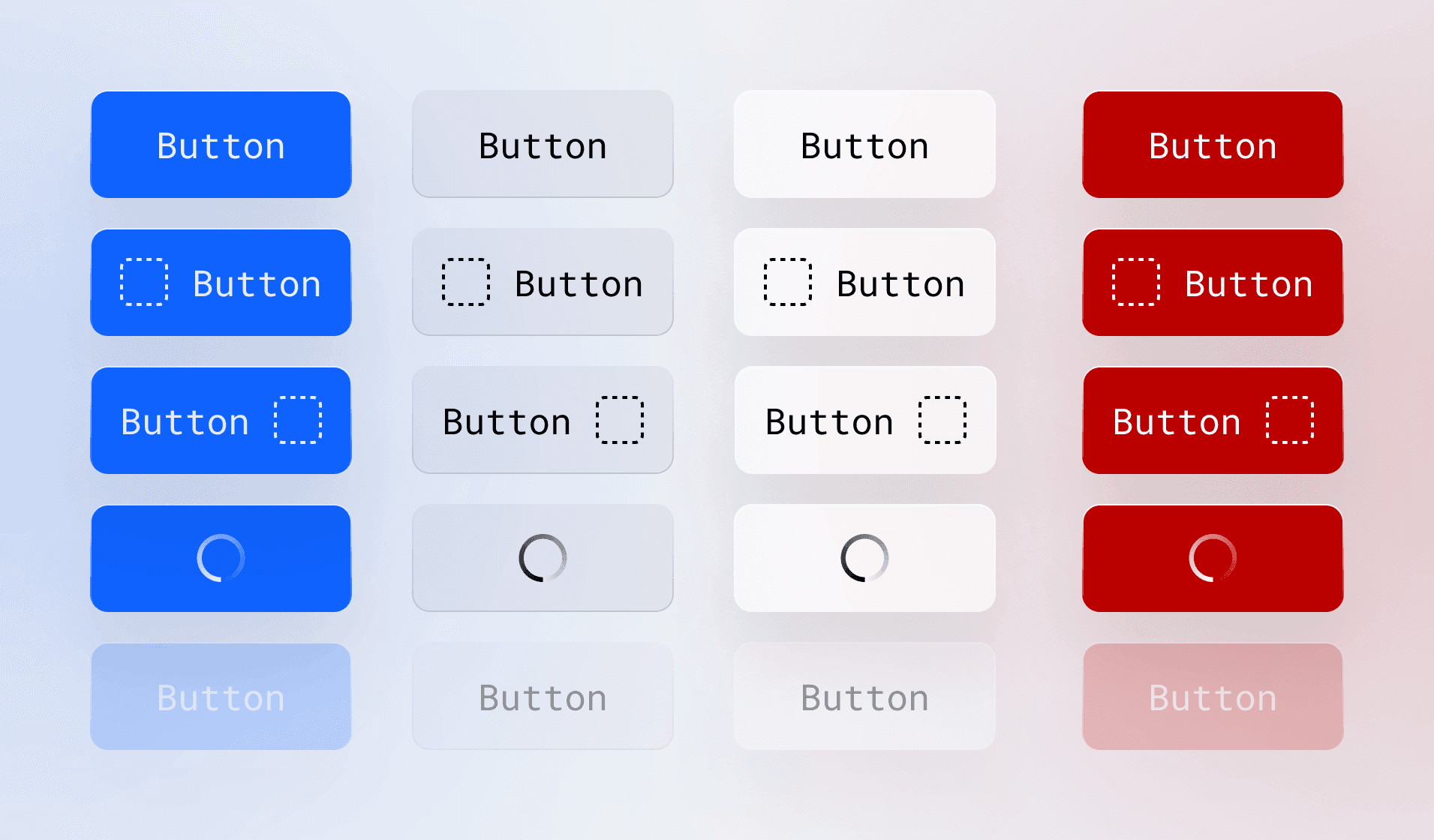
Buttons are by far the most common design system component, accounting for 23.6% of all components. They're fundamental to any user interface, enabling users to perform actions and navigate through any product. Buttons come in various styles, sizes, and states, making them highly versatile and adaptable to different contexts.
A well-designed button should be easily recognizable. You should design it to have a clear label, and provide visual feedback when interacted with.
2. Card
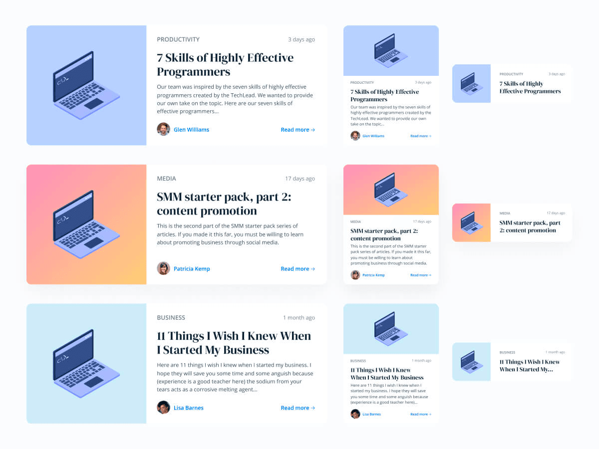
Card components are a popular way to display content in a structured and visually appealing manner. They represent 4.6% of design system components and are often used to present information in a digestible format. Cards typically include a combination of text, images, and interactive elements, making them ideal for showcasing products, articles, or user profiles.
Designing cards with consistent spacing, typography, and visual hierarchy helps you ensure a cohesive and professional look across your product.
3. Checkbox
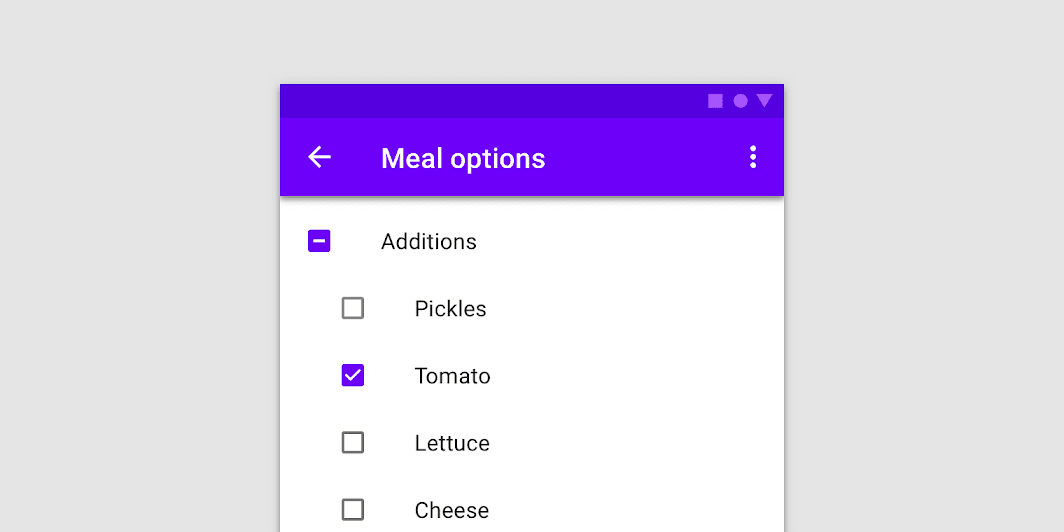
Material Design's implementation of checkboxes
Checkbox components are essential for capturing user input and allowing users to make multiple selections from a list. They account for 4.1% of design system components and are commonly used in forms, settings, and filters.
Providing clear visual feedback when selected is key to a well-designed checkbox component.
4. Icon
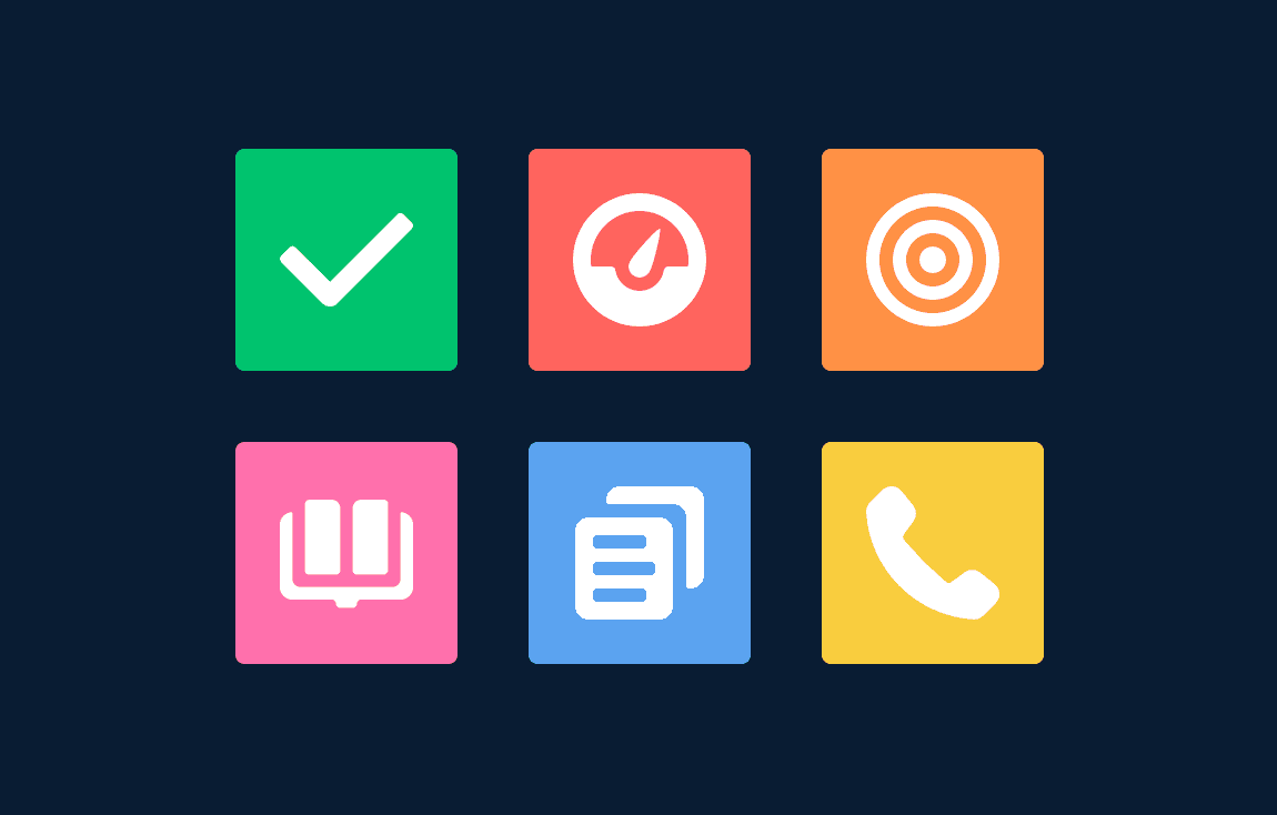
Icon components from Lightning Design System by Salesforce
Icon components enhance the user experience by providing visual cues and improving navigation. They represent 3.7% of design system components and can be used to represent actions, objects, or concepts.
You should design icons with a consistent style, size, and color palette to ensure a cohesive theme and look throughout your product.
5. Radio
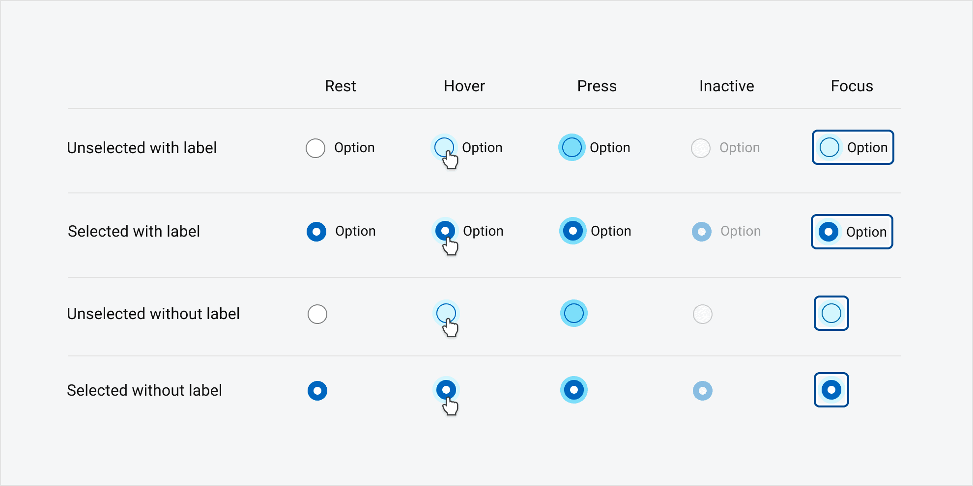
Radio button from Dell's Design System
Radio components are a variation of buttons that present users with mutually exclusive options, allowing them to make a single selection. They account for 3.4% of design system components and are commonly used in forms and settings.
Like checkboxes, You should make sure radio buttons provide clear visual feedback when selected, and be easily identifiable and accessible for users with disabilities.
6. Tab
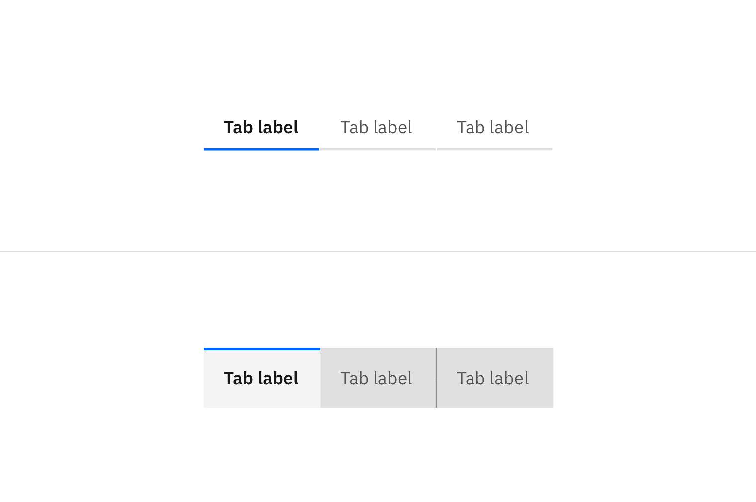
Tab component from IBM's Carbon design system
Tabs are an effective way to organize and navigate content within a single page or view. They represent 3.1% of design system components and are often used to separate related information into easily accessible sections.
You should design tabs with clear labels, consistent spacing, and visual indicators to show the active state.
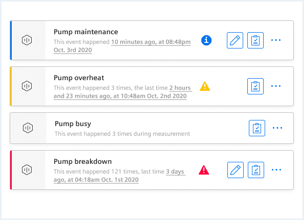
7. Badge

Badge components from Adobe's Spectrum design system
Badges are small, informative elements that display additional information or status indicators. They account for 2.7% of design system components and can be used to show notifications, labels, or tags.
You should design badges with a consistent color palette, typography, and size to ensure they are easily readable and visually appealing.
8. Select
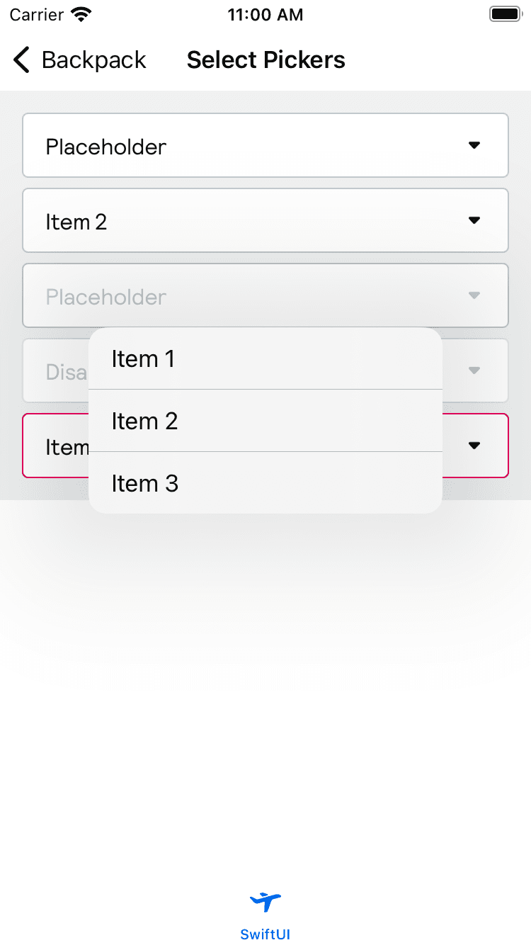
Select component from Skyscanner's Backpack design system
Select components, also known as dropdown menus, allow users to choose a single option from a list. They represent 2.6% of design system components and are commonly used in forms and filters.
A well-designed select component should clearly show the different options and give visual feedback for selection.
9. List
List component from Siemens' design system
Lists are used to display a collection of items in an organized and structured manner. They account for 2.6% of design system components and can be used to present data, navigation items, or search results.
You should design lists like labels and other text components and tokens with an eye on consistent spacing.
10. Avatar
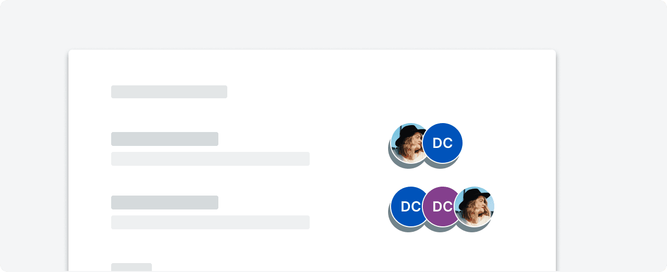
Avatar component from the CORE design system
Avatars are visual representations of users, often displayed as profile pictures or icons. They represent 2.5% of design system components and are commonly used in user interfaces to personalize the experience and provide context.
Avatars can be designed as static images, initials, or even interactive elements, depending on the product's needs. Research well what the different use cases would be to make sure they're effective components.
That wraps up the top ten — we hope this list was informative. Together these top ten components only made up 53% of all components! Did the components you expect make the list? Did your favorites make it? Share your thoughts with us on Twitter. If you're ready to embark on your components journey, read Gerri Reid's blog post — How to Create Accessible Design System Components — to get you started on the right foot.