Unlock the Power of Supernova's Content Blocks for Design System Documentation
- Authors

- Name and Role
- Nezar MansourContent Writer
We've talked before about design system documentation and how integral of a role it plays in your design organization. Without documentation guiding your design principles, tokens, components, and patterns, your design system would be just a library. But documenting a design system well takes a lot more than just text and images — you need a dedicated tool. In this article, we'll delve into Supernova's diverse set of content blocks and how they can help you create the documentation of your dreams. We'll explore the different blocks, show how they're used, and share some best practices — so read on.
Documentation content blocks in Supernova
Supernova's documentation engine is instantly familiar to anyone that tried any other text editor but even more so to those familiar with block editors like Notion. The block system helps you call on any element or formatting that you would need in your design system documentation.
There are around 30 blocks available on Supernova, but instead of going through all of them, we'll focus on the most interesting ones that will take your design system to the next level.
Tokens
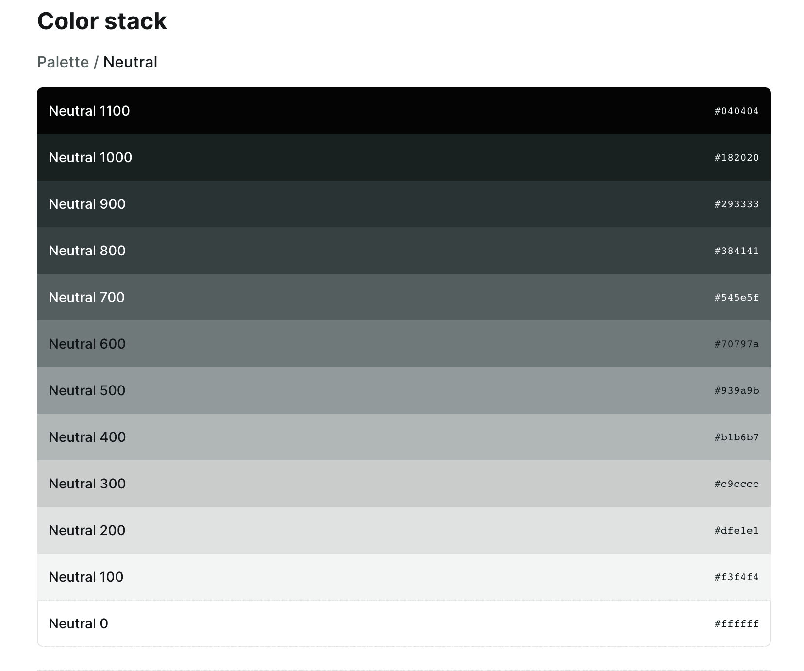
We've talked before about design tokens and their importance. And as the “atomic elements of design within a brand” they’re your design system's core building block. It's important that you're able to display your tokens in your documentation, which you can do with the different Token blocks.
Example: Use a Token block to add the specific color token of your primary brand colors while documenting their use case, ensuring a consistent visual identity across your content.
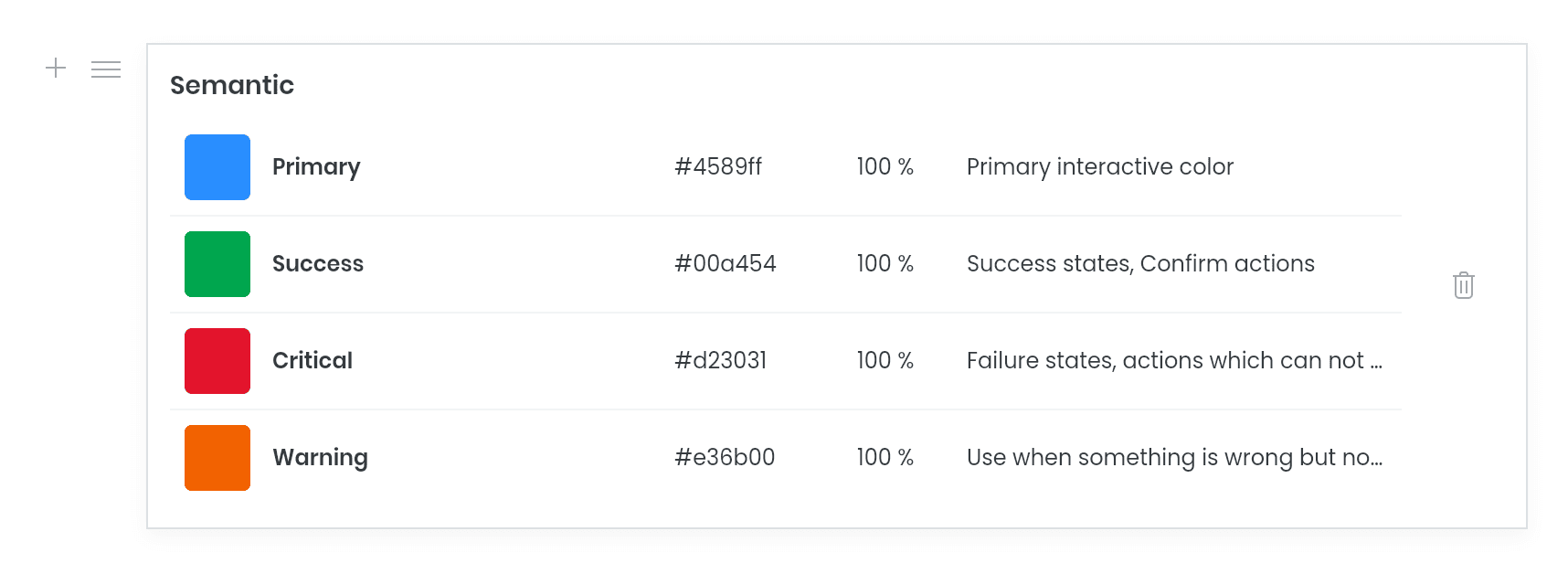
Best Practice: Like any documentation, you need your readers to be engaged and to do that, you need to have flexibility in how you can display tokens. Utilize Supernova's Token block variants to tailor your documentation to your design system and make it more contextual. Like for example, you can use the color stack variant to display a palette of colors in a more natural way.
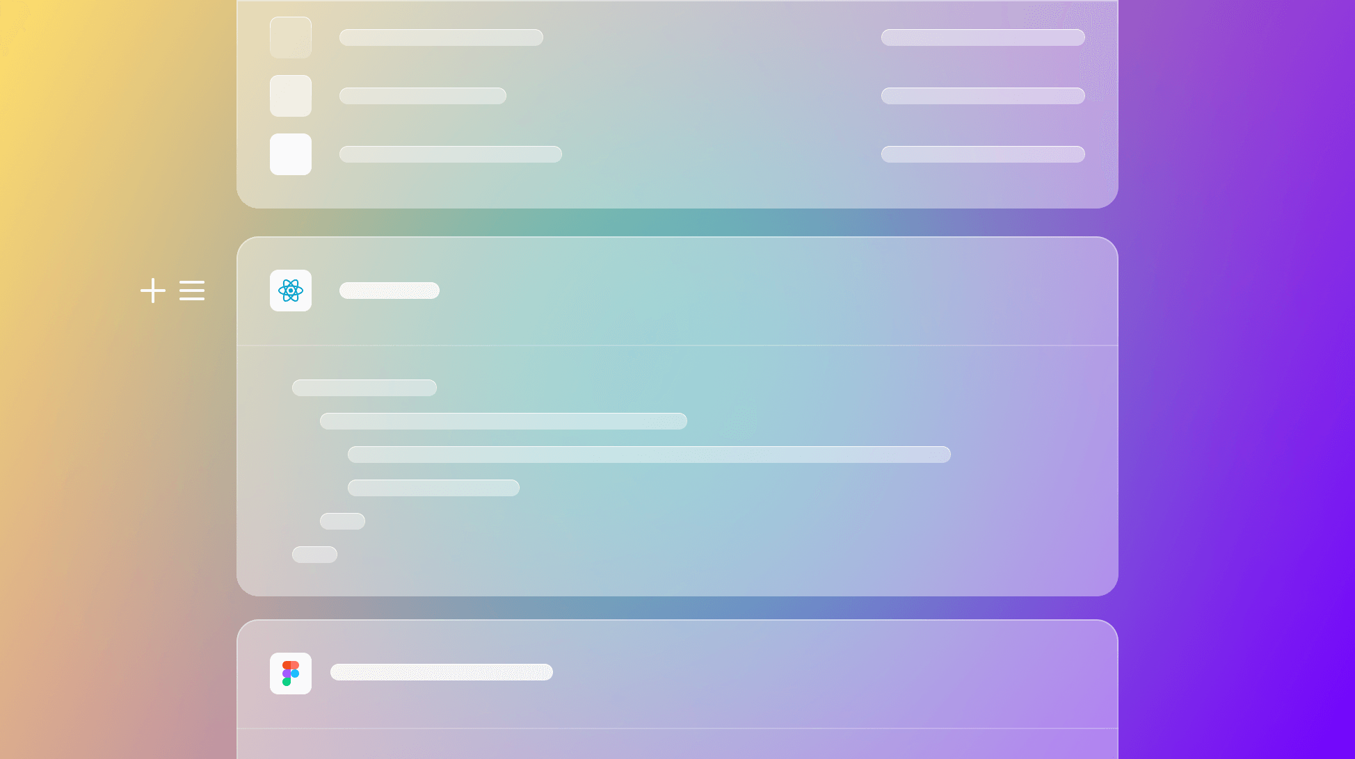
Figma frame
Your design system documentation isn't complete without your visual designs. Instead of taking screenshots of your screens, components, and assets, you can utilize the Figma frame block to embed a frame directly from your Figma source that will be automatically updated with any change in the file.
Example: Using the Figma frame block to showcase your different icons.
Best Practice: Combine Figma frames with component, code, and Storybook blocks to give the full picture of different UI elements in your documentation. Design visuals are just one piece of the puzzle. Combined with implementation, details, and guides it helps your design system documentation be actionable and useful for your consumers.
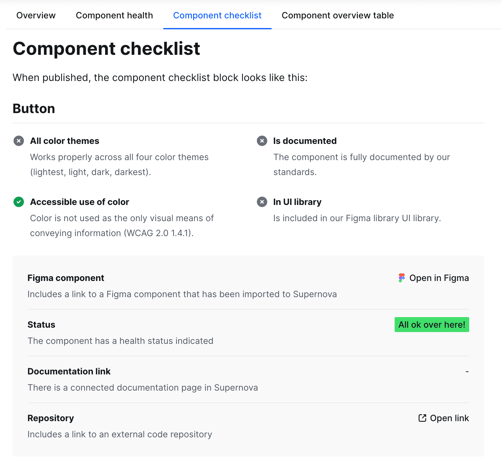
Components
The component block empowers users to give contextual information on specific components to your documentation. You can flexibly change and add all the details you track in your Components view and make sure your documentation always stays up-to-date.
Example: Incorporate a component block to seamlessly integrate a navigation bar into your webpage, providing users with a consistent and intuitive browsing experience.
Best Practice: Define clear guidelines and documentation for each component, including usage instructions and variations. This helps maintain consistency and enables efficient collaboration among designers and developers.
React code
With this block, you can render live React code right into your documentation. This helps you show live behaviors and use cases that would normally need a testing ground for your product to showcase.
Example: Showcase the implementation of components using React code blocks. Share the code snippets that power your user interface elements, such as buttons or interactive forms.
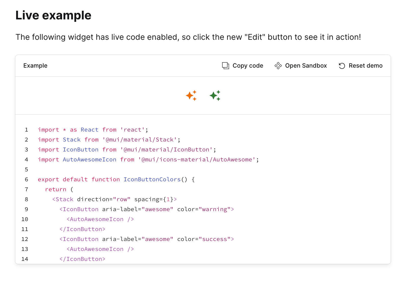
Best Practice: Add clear explanations and annotations alongside your React code snippets to ensure that readers understand the purpose and functionality of each component.
Storybook embed
The Storybook embed block enables the integration of Storybook stories into your content. Storybook is a great tool that many teams use for documenting and testing screens and components. And with the Storybook embed, you no longer have to choose between using Storybook or Supernova — you can use both!
Example: Add a Storybook embed block to showcase the functionality and usage of your components. Highlight how users can interact with the components and explore their various states.
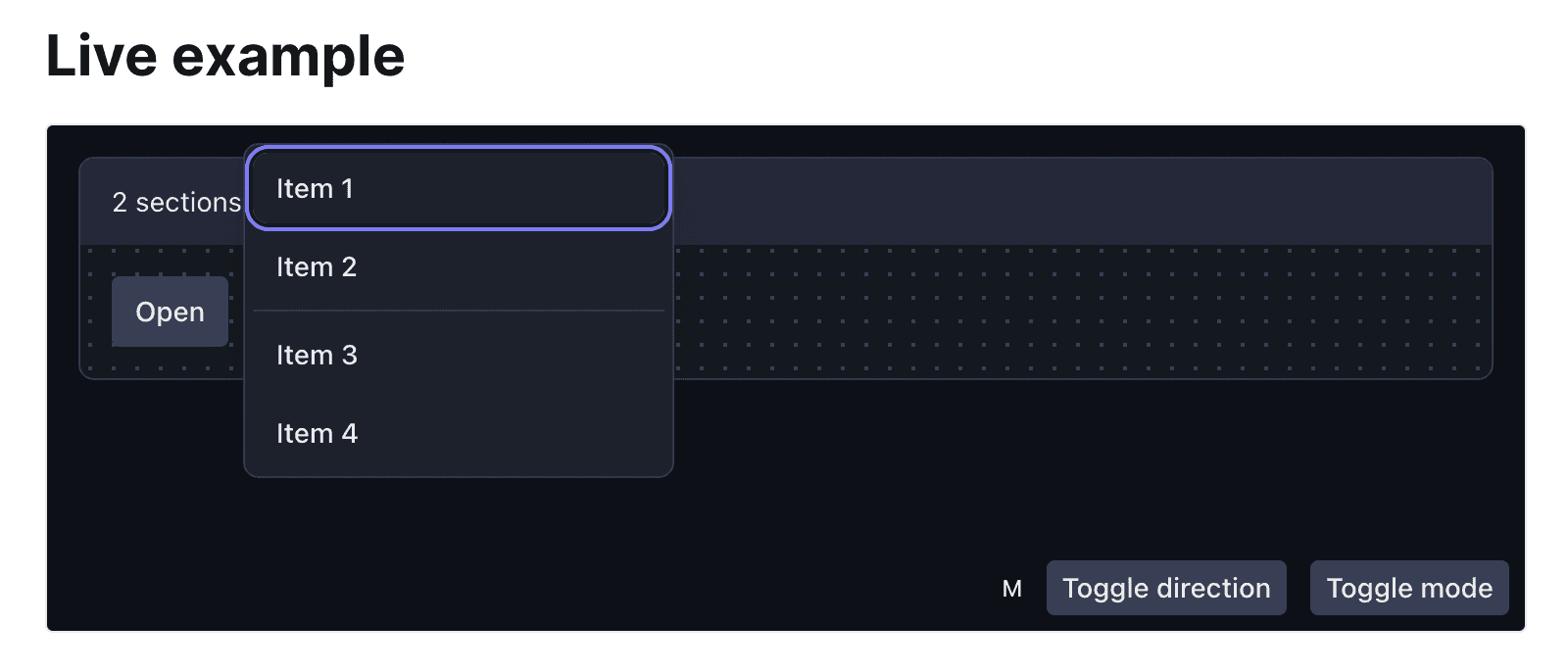
Best Practice: The Storybook content block helps you keep Supernova as your single source of truth. Simplify your team's design process by consolidating them in one tool instead of getting lost in a sea of files. And similar to the react code embed, you can make the most out of Supernova by combining multiple blocks to give your team all the information they need for any component, screen, or pattern.
Supernova's content blocks offer a powerful toolkit for creating dedicated design system documentation. By incorporating these content blocks and following the best practices, you can take your design system to the next level, and your team will thank you for it.
Check out the full list of content blocks in Supernova Learn (and see our documentation tool in action). Plus, if you can't find the perfect content block that suits your team, you can create your own custom block! We'll be back with an in-depth look and details on how to use them effectively.