How to Document Your Design System Components in Supernova
- Authors

- Name and Role
- Nezar MansourContent Writer
Components play an integral role in any design system. Designing and creating your components is only one step of the process. To make sure your components are being effectively used and implemented, you need to document them thoroughly.
In this guide, we'll take you through all the stages of efficiently documenting your design system components with Supernova. We'll go over how to import your designs, manage your components, easily create documentation pages, and all the best practices for documenting components — catering to your entire team, from designers to developers.
Getting started with Supernova
We'll be using Supernova to document our components. Supernova lets you automatically import all our designs from Figma, and then easily document your design system components with just a few simple steps.
Get started with Supernova for free by signing up and logging into your account.
Import your components from Figma into Supernova
The first thing we want to do is to import our design files from Figma into Supernova. To do this, we'll log in to our Supernova account and open the Figma file we want to import.
First, you'll need to publish your Figma file as a library.
In Supernova, in the left sidebar, head to the Data sources section. Once you're there click on + New data source.
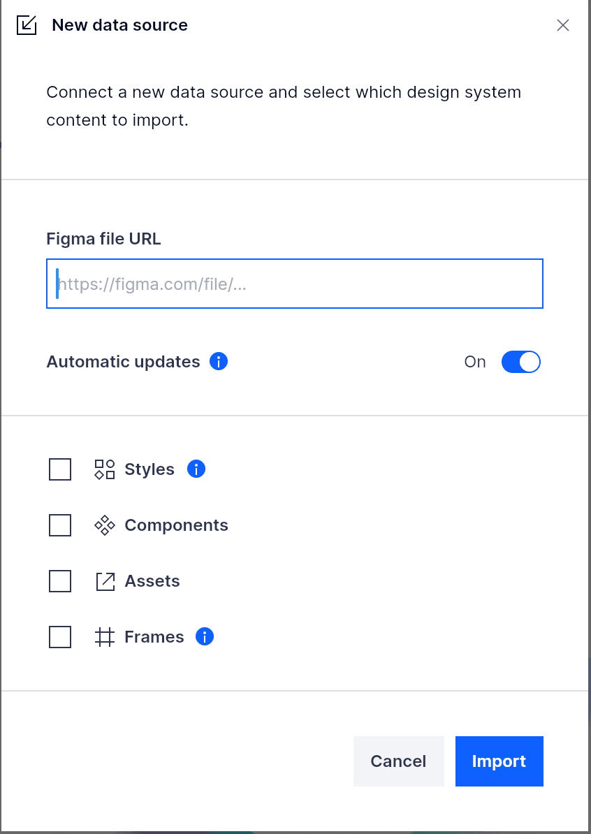
Add your Figma file URL and make sure to select all the options to import. You can also enable the Automatic updates option to keep your design system up to date automatically. Check out our full importing guide to learn more.
Manage and add your components
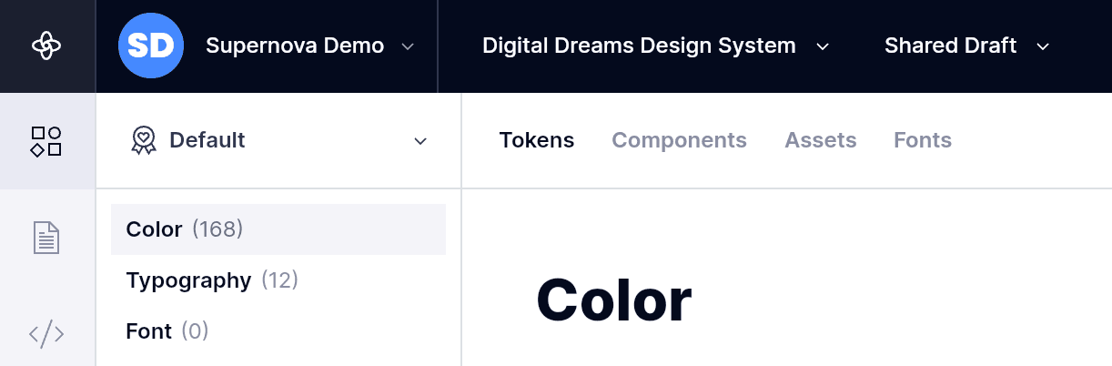
With our designs imported, head to the Design system data section from the left sidebar, then click the Components tab.
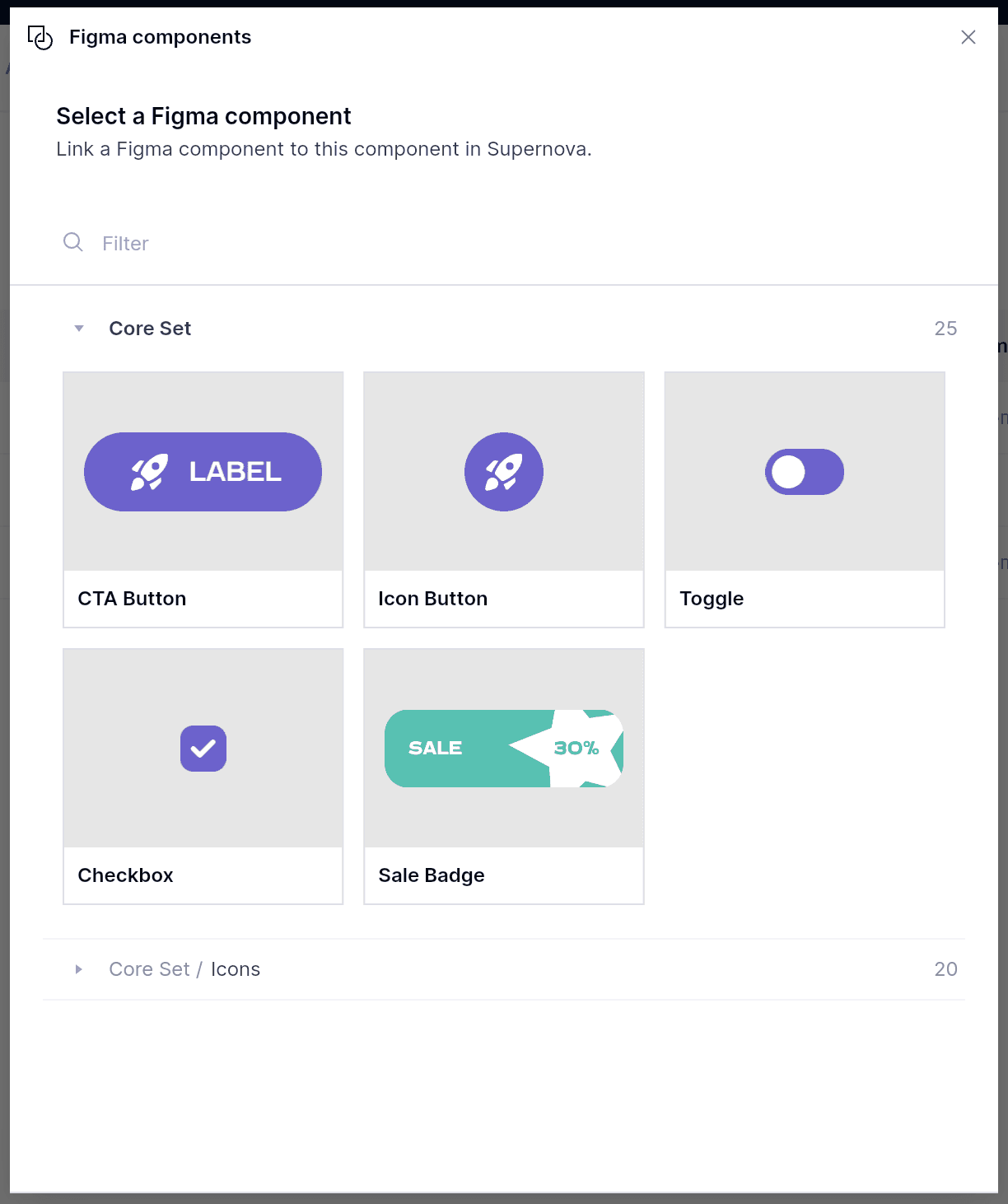
Once in the Components view, we can start adding our components and linking them to their Figma counterparts. This will help ensure that the correct components are connected and that you can manage them from one place. Click on the + New component and fill out the name. Under the Figma component column, click on your component and select which component you want to link to.
Once that's done, you can add any more details you wish in the component's row and then move on to the documentation.
Document your components in Supernova
Now that our components are correctly imported into Supernova let's head over to the Documentation section from the left sidebar.
Create and organize pages
Supernova lets you completely tailor your documentation to your design system with an easy-to-use editor and flexible content blocks. You will have a default set of populated pages and sections, but you can add your own with the + Add button in the left sidebar.
Under the Components section, click on one of the components. In our demo, we will be using a calendar component.
Add components using Figma Frame
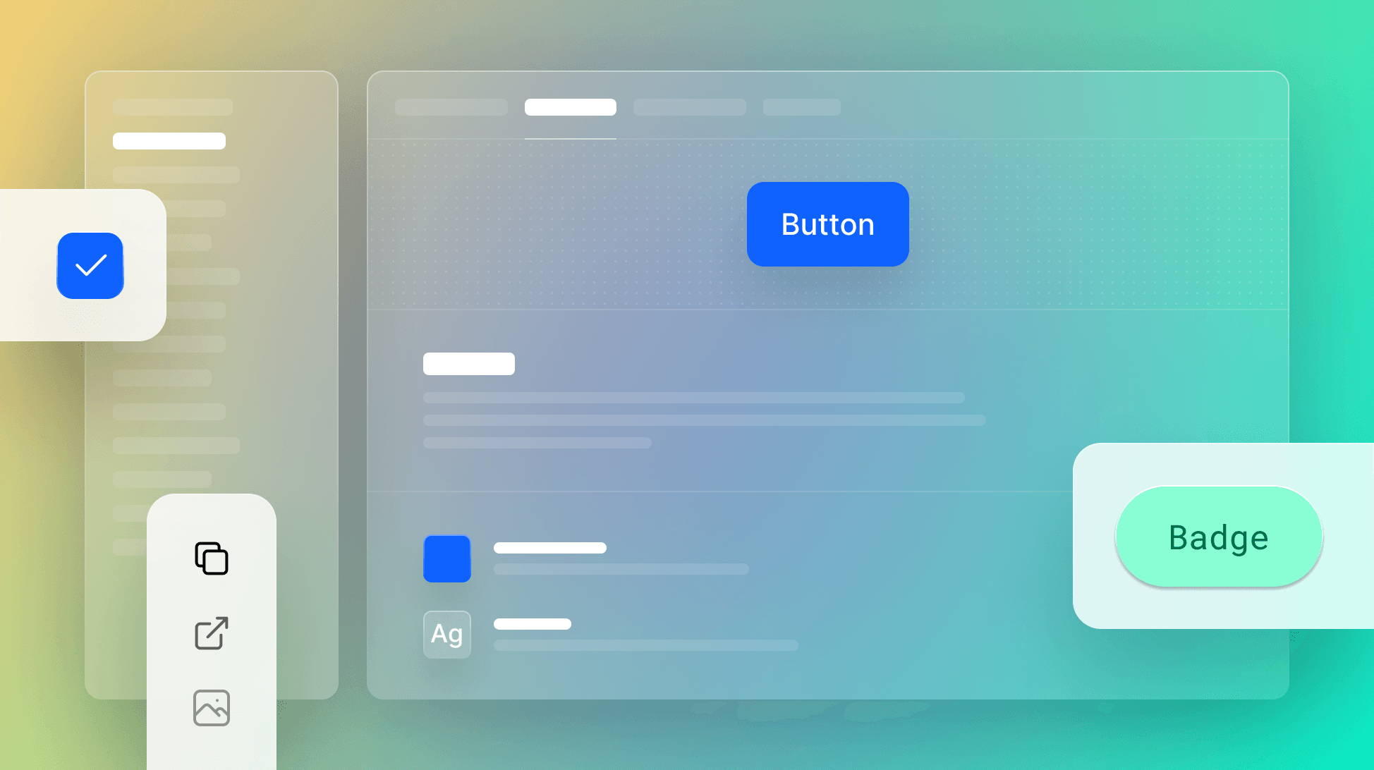
The first step of documenting your design components is to display them. This will give readers an instant idea of what the component is and many of its features. To display a component in Supernova, type '/’ or click the + button to add a Figma Frame block. Click + Add frame and from the Figma content selector find your component.
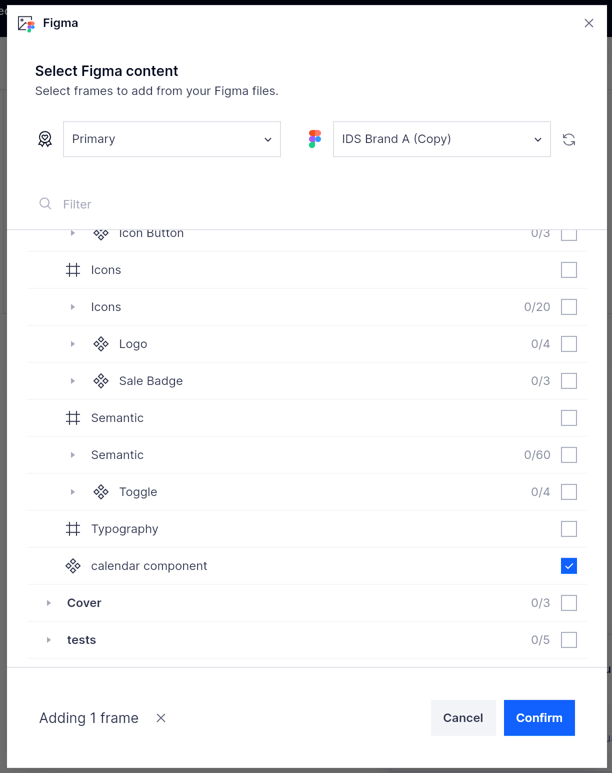
After selecting your component, click confirm, and your Figma frame will be displayed right in your documentation.
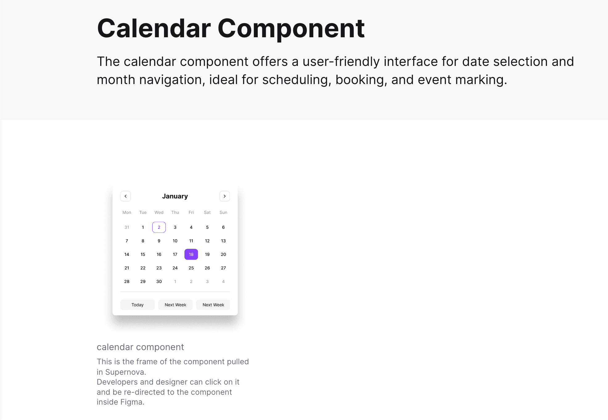
Using Figma Frames lets you be flexible with what exactly you want to showcase with your component.
Best practice using Figma Frames
Make the most of the flexibility of Figma Frames to share more visual information about a component. You can freely annotate or edit your component in Figma and it will be automatically updated in Supernova.
It's also very useful to break down the anatomy of a component to quickly convey its properties. Within the documentation you easily add details for each part of the component.
Adding component health status
After showcasing your component, the next relevant piece of information that users will want to know quickly is the status or health of a component. At a glance, users can know the component's health, whether it's fully documented, and link to it in Figma or the code repository.
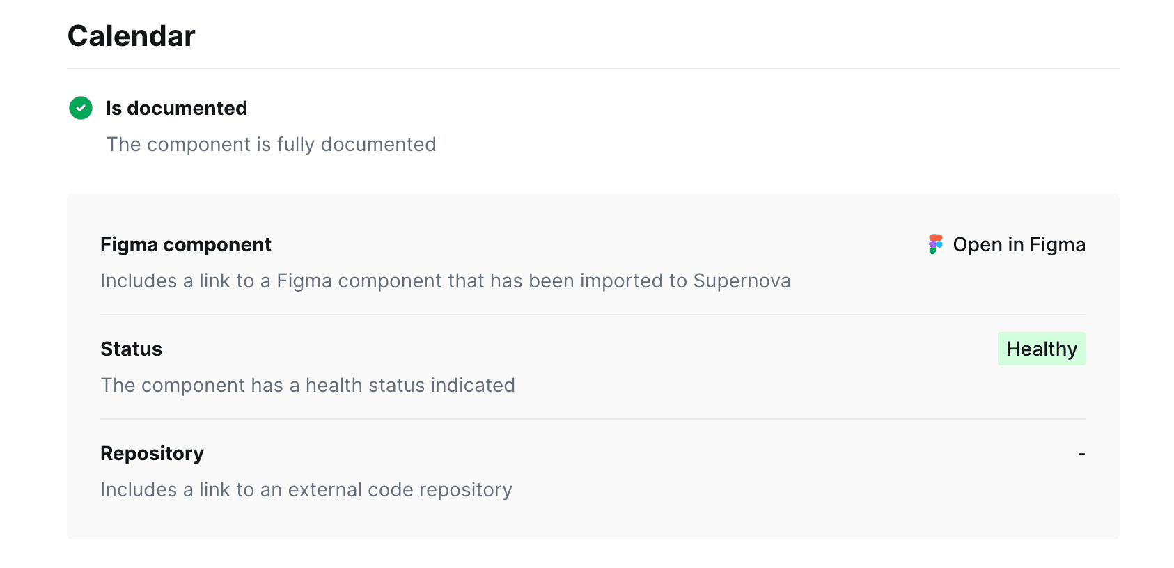
You can also add and remove any more details that you add from the Components management view. To add these details to your documentation page type '/’ or click the + button to add a Component Checklist or Component Health block. Select your component, then select which properties you want to showcase. Once you publish your documentation, users will be able to get critical information on your component as soon as they open the page. Also check out our detailed guide on how to track and document component health.

State of Components 2023 Report
Get the latest insights on component trends and best practices.
Download Now](https://www.supernova.io/state-of-components#download)
Component usage and guidelines
Documenting the usage and guidelines of a component is crucial. It ensures that designers and developers understand the component's purpose, its intended use cases, and any constraints or best practices associated with it. Geri Reid, former NewsKit Design and Accessibility Lead, shared all the details on how to effectively document the usage and guidelines for your accessible components in Supernova. Here, is a broken down version to help you document quicker:
1. Component anatomy
- Structure: Break down the component's underlying HTML and its smaller building blocks.
- Visual Representation: Create an anatomy diagram to communicate the component's structure.
2. Design properties
- Dimensions: Specify the default size.
- Color Scheme: Detail the primary, secondary, and accent colors.
- Typography: Define font styles, sizes, and weights.
- Spacing: Provide information on padding, margins, and spacing.
3. Component options
- Variations: Define the different versions or styles of the component.
- Appearance & Orientation: Detail the component's visual and functional options.
4. Usage guidelines
- Purpose: Describe the main function of the component.
- Best Practices: Offer recommendations on how to use the component effectively.
- Do's and Don'ts: List specific practices to follow and avoid.
5. Interaction & behavior
- Interactivity: Define the different states of the component, especially if it's interactive.
- Visual Indicators: Ensure clear visual differentiation between states.
6. Keyboard interaction
- Navigation: Specify how users can navigate the component using the keyboard.
- Shortcuts: If applicable, provide keyboard shortcuts for quick actions.
7. ARIA & accessibility attributes
- Role & Attributes: Define the ARIA roles and attributes to enhance component accessibility.
- Assistive Technology: Ensure compatibility with screen readers and other assistive tools.
8. Props & overrides
- Functionality: Determine the props and overrides needed to support the component's options and behaviors.
- Customization: Allow users to modify or extend the component's default behavior.
Use our Components Documentation Template
Get started on the right foot with our Components Documentation Template. Enter your email and download it for free.
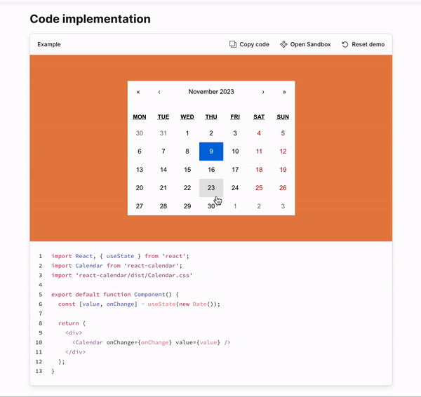
Document component code and implementation
A common failing of design systems is that they cater more to designers than developers, if at all. No design system documentation is complete without documenting the code and details developers need to implement components. Supernova was always built with developers in mind, and to help you document your components effectively, you can utilize live code blocks or Storybook embeds to showcase your components in action.
Live React code
In your documentation, you can either host your code as a code block for a variety of your code implementations. This helps developers find the latest component implementation in a central source, connected to its variations, guidelines, and more helpful information. You can add a code block simply by typing '/’ or clicking the + button to add a Code block. You can then select the language of your choice and paste in the code.
You can take it a step further with a Render React code block that both shows your code and a live implementation of it. Follow the same steps, but instead, add a Render React code block, paste your code and watch it in action.
Storybook embed
Another popular option for code implementation is connecting with Storybook. Many dev teams already rely on Storybook, and embedding it in Supernova helps create a central source of truth for your entire team.
You can follow our full guide on embedding Storybook blocks and see your components in action.
This guide scratches the surface of what Supernova and design systems can do. Laying the correct foundations for your components and designs is key to driving adoption, streamlining product development, and improving consistency. Still unsure where to start or want to take inspiration from successful design systems out there — check out:
- Backpack by Skyscanner
- Hearst Design System
- Burrito by Userlane (Also check out How Userlane Kickstarted Their Design System Using Supernova)
Get started with Supernova for free by signing up. Start documenting your design system components like never before. Follow us on Twitter for more information and guides on Supernova.