Documenting your design token system
A good token system isn’t just about structure. It’s about clarity. Anyone on your team — designer, dev, PM, new hire — should be able to look at a token and know what it is, what it does, and where it’s used.
Supernova helps you make that happen without the fuss. With dedicated blocks, multi-theme views, and accessible visuals baked in, documenting your tokens is no longer an afterthought — it’s part of the system.
🔖 Use dedicated token blocks (yep, we’ve got three)
Supernova gives you purpose-built blocks just for documenting tokens. Pick the right one for your needs and let your tokens do the talking:
1. 🎨 Design tokens block
The main one — shows tokens grouped by type (color, spacing, typography, etc.) in a clean table or grid view.

→ How to use it and set it up ✨
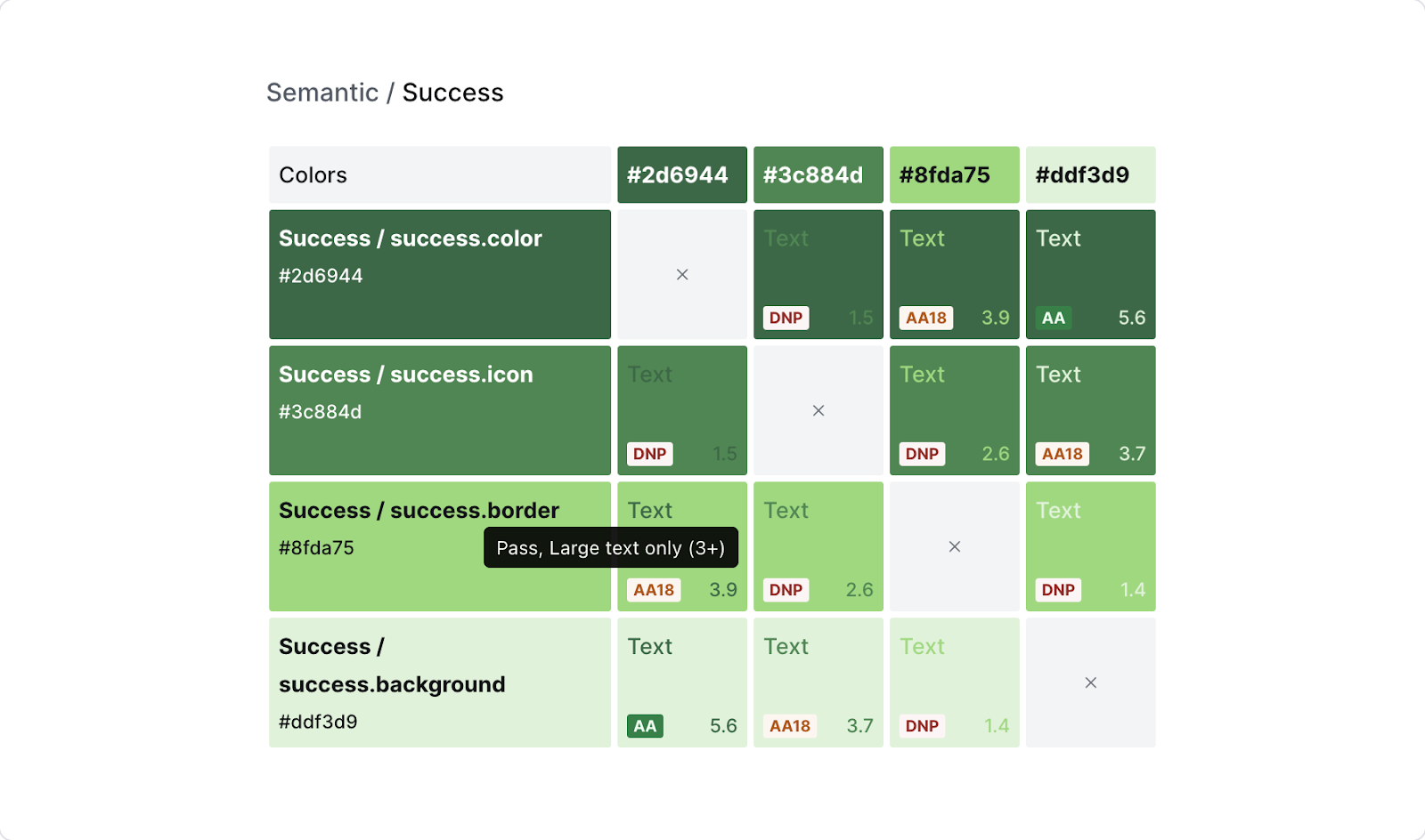
2.🏁 Accessibility color grid
Automatically visualizes contrast ratios between text and background tokens — great for surfacing accessibility wins (or issues).
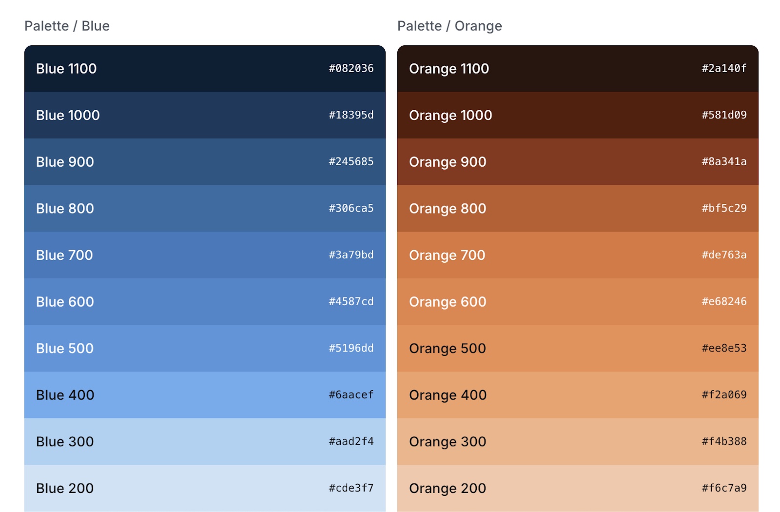
3. 🌈 Color ramps block
Perfect for showing full color scales at a glance — whether for brand primaries, neutrals, or semantic ramp values.
→ Learn how to set it up here ✨
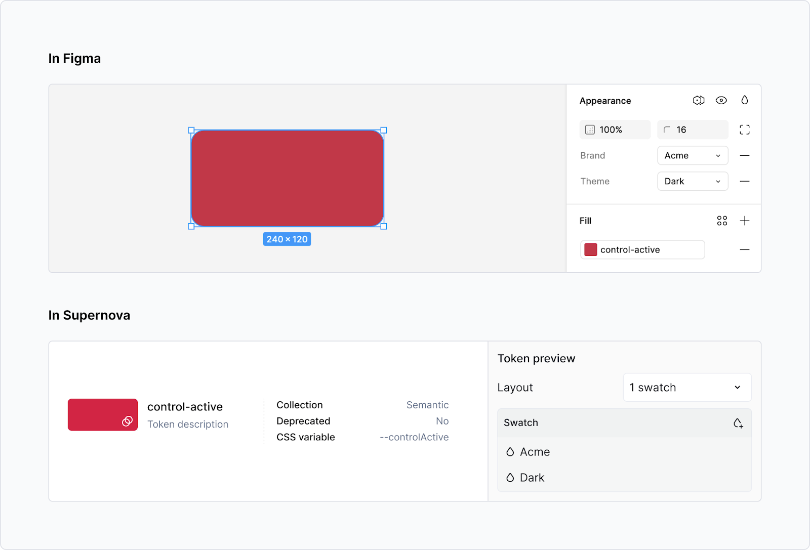
Each one is fully connected to your live token system — so updates happen automatically. No need to copy-paste values from Figma or update screenshots manually. Ever.
🎭 Want to show multiple themes? We’ve got you
Supernova makes it dead simple to display how tokens change across themes — like light/dark mode, or Brand A vs Brand B.
You can choose:
- Split view → see both the base value and override side by side
- Override view → show only the themed version
This way, you’re not just documenting a token — you’re documenting how it behaves in the real world.
🔍 Looking for inspiration? Here’s how 5 teams do it
Need ideas for how to structure or elevate your token documentation? Here are five Supernova-powered design systems doing it right — each with a different approach worth stealing (respectfully).
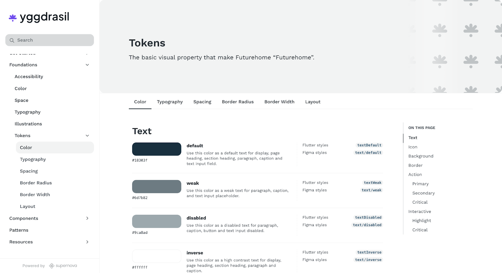
1. 🧊 Yggdrasil Design System
A clean, readable setup that shows tokens and their properties without fluff. Easy to browse, easy to trust.
2. 🌿 Greenhouse
Thoughtful documentation with helpful visuals and clear logic behind every token group. They don’t just show tokens — they explain why they exist.

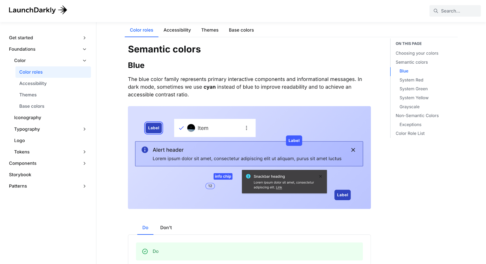
3. 🌗 LaunchDarkly
A standout example of documenting accessibility with color tokens. Great use of contrast examples and clearly defined color roles.
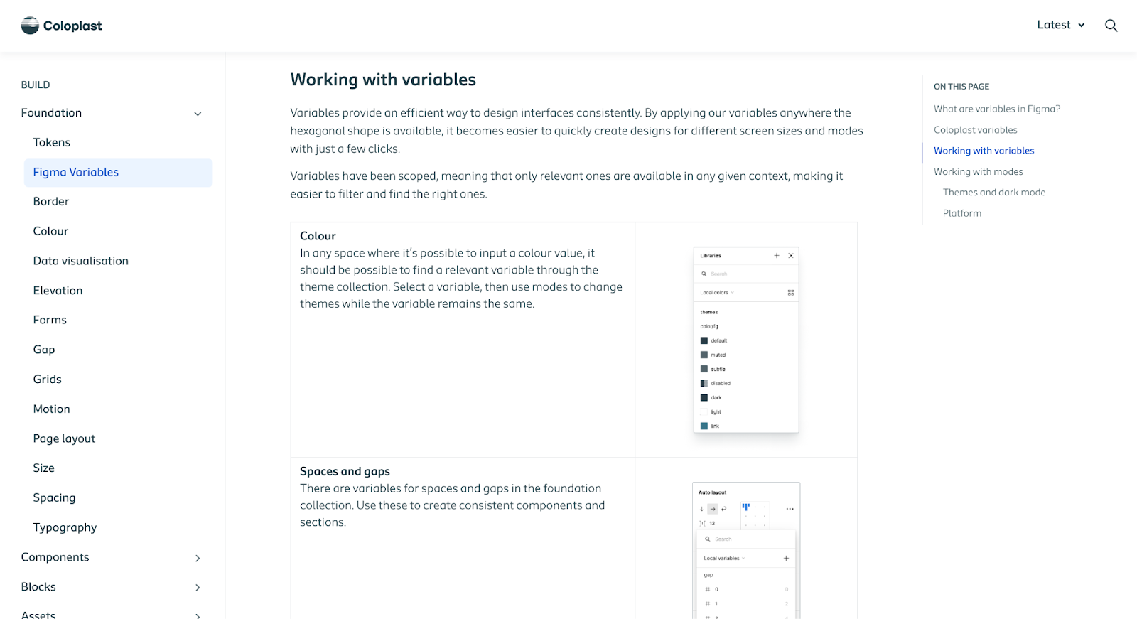
4. 🩺 Coloplast Design System
Excellent at breaking down token hierarchy and explaining how their Figma variable setup maps to Supernova — including the logic behind their collections.
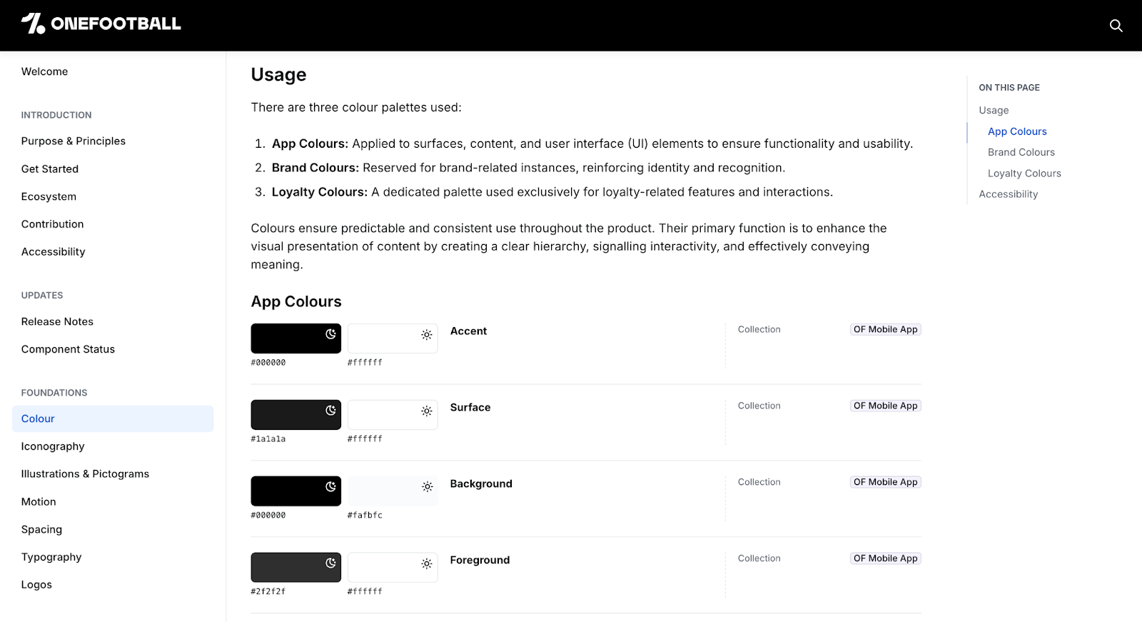
5. ⚽ OneFootball
A great example of how to use the theme block to document multiple themes (like light/dark or brand variants) clearly and visually
🧠 Tips for clean, useful token docs
- Use short, clear descriptions for each token (we import them from Figma if you’ve written them there!)
- Group tokens by collection to reflect how your system is structured
- Use the grid view for visual tokens (like colors) — it’s way easier to scan
- Show just enough — don’t overwhelm people with internal-only or legacy tokens unless they need to see them
- When displaying tokens in a block, if you select “group selection” these will be automatically updated if you add/ remove tokens from that group in FIgma
TL;DR: Good tokens deserve good docs
- Supernova gives you 3 dedicated token blocks for color, accessibility, and ramp visualization
- You can show tokens across multiple themes — light/dark, brand variants, etc.
- Descriptions, scopes, and grouping all sync from Figma and show up automatically
- The result: clean, live, developer-ready docs that grow with your system
Documentation should help your team move faster — not slower. And now it does.